3 Ways to declutter your website design

tell me if you can relate to this scenario...
You found a website template you really liked, then maybe adjusted the fonts and colors to your liking. You then opened up a blank page, pasted in all your photos and text, and thought,
“That’s everything I need to do, right? So… why doesn’t it look good at all??”
No hate to you! I went through the exact. same. thing when I was first getting the hang of websites.
I had chosen a template with great potential, but if the pre-made layouts didn’t fit the content I needed to display, I was in trouble.
I found myself many times staring at a messy scramble of words and images that looked out of place, not knowing how to improve the flow of it all.
Well lucky for both of us, practice makes perfect.
I’ve since overhauled many-a-websites and I can tell you some of the most common things we often do to unnecessarily overcomplicate the design (without even realizing it).
I’ll share some tricks of the trade so your website can look more pro 🙂
Let’s do it!
how to simplify the visual noise on your business’s website
1. Don’t be afraid of negative space
We often cram our content into every nook and cranny of the page, thinking that every space has to be filled with something useful in order for the website to be effective.
But that actually has the opposite effect.
Instead of keeping site visitors engaged, it makes it less likely that they will stop and read those details we’ve taken the time to write - because it all looks like one big jumbled up mess.
When you add more negative space between the elements, it gives our brain a chance to pause and digest before moving on to the next piece of info.
It’s more comfortable for our eyeballs and it can look more purposefully designed!
So then, all that copy that you’ve wisely condensed into bite size chunks actually gets noticed.
(Squarespace users: the Spacer Block is your best friend and she’s craving more attention!)
Take this section of a sample home page. If you started laying all your pieces of content one on top of the other, it gets pretty messy pretty fast.
Before

After

But if you add more space between each section, there’s now a better flow as you scroll down the page.
And it looks way better, right?!
Another way you can use negative space is to off-center different blocks of content.
Again, this helps break up the page so it’s not so congested, while incorporating an unexpected element of design that intrigues your readers.


Here’s a Squarespace 7.1 Template that uses lots of negative space in varying ways. (PS. That’s an affiliate link!)
Notice how they’ve even anchored some sentences to the extreme left of the page with nothing filling up the space to the right of them.
Guess what - you have permission to do that too! 😆
2. Using color sparingly makes more of an impact
Here are the two golden rules I design by when it comes to color (choose one):
Rule A. Use 1 or 2 subtle colors everywhere, and keep it consistent
Rule B. Use little touches of multiple colors, with lots of white space to balance it out
Let’s look at a few successful examples and how they could have gone wrong.

This website follows Rule A.
Every color on the page aside from black/white falls in the green and blue shade range.
All the colors are fairly subdued; there are no giant sections of neon green right next to some neon blue.
Additionally, it’s important to note that the colors in the photos fall right in line.
The page would look a lot less “put-together” if one of the pictures contained, say, a bit of red or yellow.
And it makes all the difference!

This site is following Rule B.
There are FOUR different accent colors but it doesn’t seem overwhelming because all the white space and black text balances it out.
These colors are mostly pretty bright, but they don’t have to compete with each other because they are playing nicely. 😉
If, on the other hand, there was no black text and every sentence was a different color, it would start to look a little crazy.
Or, let’s say you had a bright yellow section on top of a hot pink section on top of a dark green. All of the sudden the exact same color scheme is looking insanely busy.
So less is more here!

And here we are seeing another example of Rule A.
You are seeing the same shade of muted blue across the whole site, so even though there’s a lot of it, it doesn’t become too busy.
On top of that, all the photos use the same accent color - a soft pink. This keeps everything nice and cohesive!
3. Create more contrast between your headings and your body fonts
Often times if your body paragraph and heading fonts are too similar in size, style, or weight; the content looks more cluttered.
Just take this before and after case:
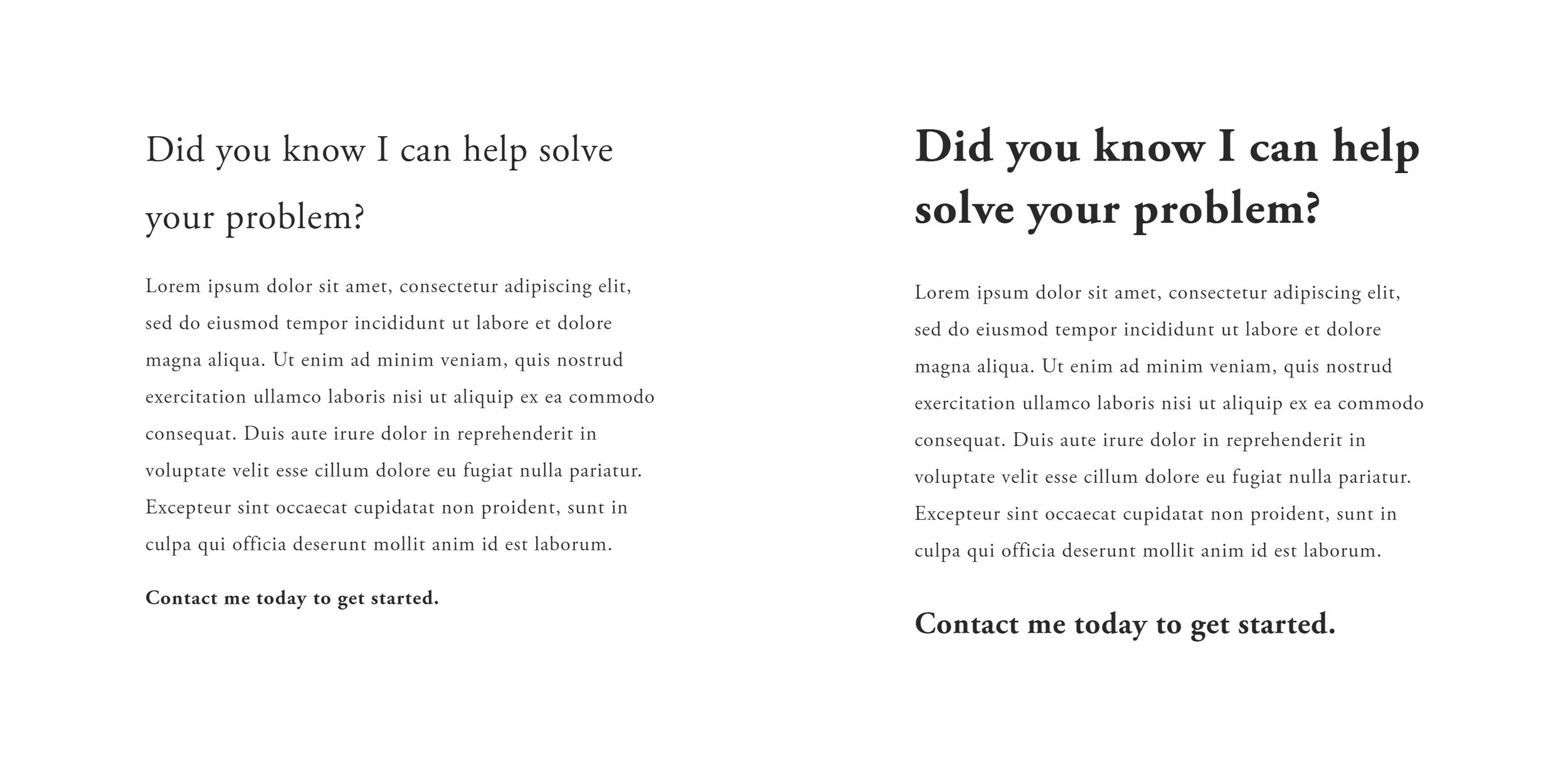
This particular one is a subtle difference, but they each make a significantly different impression.
If you have a whole page filled with chunks of text similar to the style on the left, it’s likely to seem more laborious to read through.
The style on the right with a bolder heading helps to differentiate the text and more effectively invites the reader in.
Let’s look at a hero banner or “title section”.


Again, the first example here looks just a bit more crowded than the second, because the two headings are so similar in size.
And a bonus? The more bold you are with your font sizing, the more confident your brand will appear!
This first image is a good illustration of how so many of us design our websites starting out.


Even though we’re breaking up our copy into different sections, it’s still all blending together into one boring blob on the page.
Increase the contrast in size between the two columns of text and all of the sudden, your site looks cleaner!
Are you going to apply any of these tips to your website? If so, be sure to leave a comment below!