
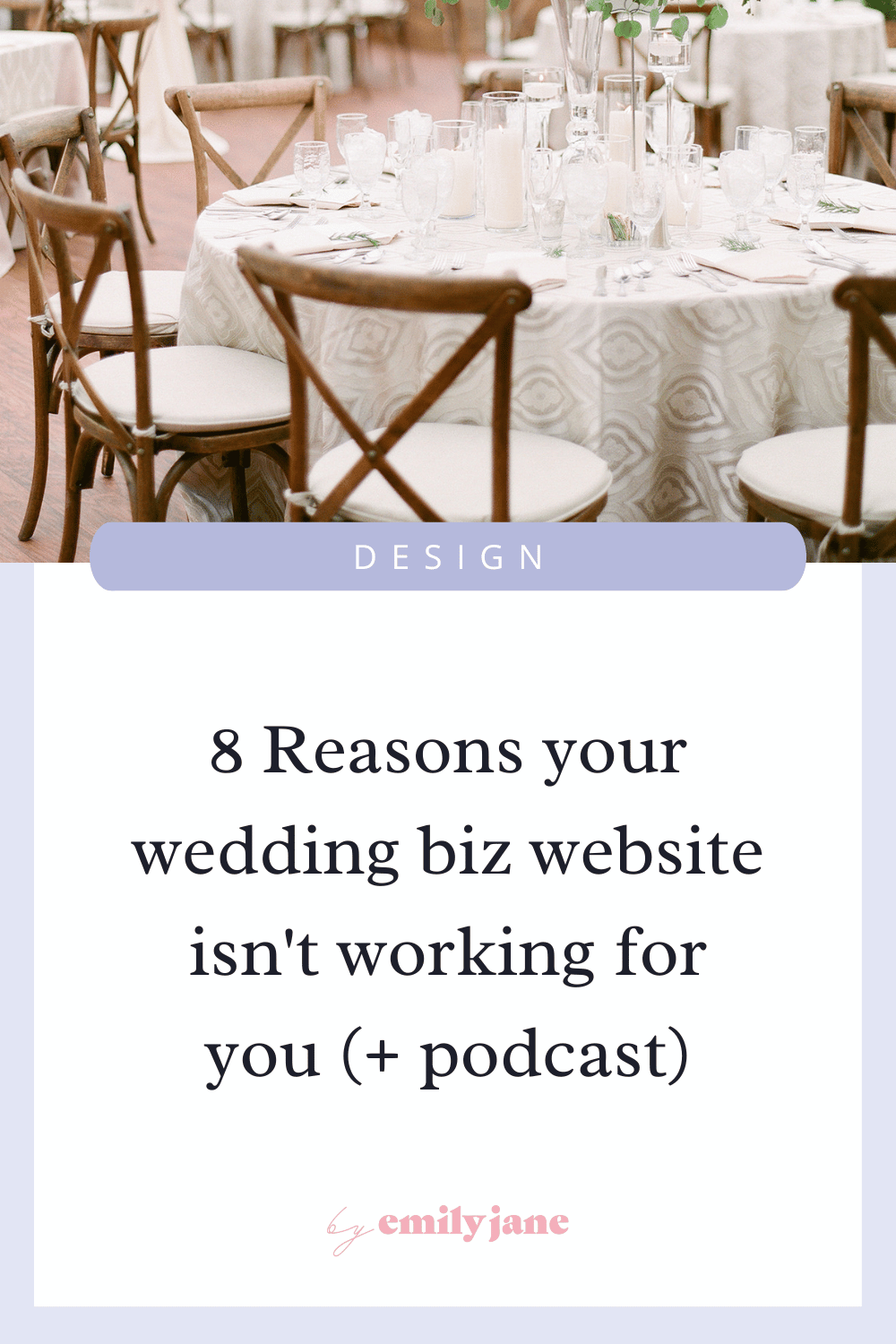
8 Reasons your wedding business website isn’t helping you book couples (+ Podcast episode)
Is your website working to get you consistent leads for your wedding business?
If not, it may be time to run a conversion audit!
I’m sharing a podcast episode from Becca Pountney’s Wedding Pros Who Are Ready to Grow Podcast, where we talked about some common website mistakes I see as a professional website designer in the wedding industry.
You can also read all my recommendations from the episode below!
Listen on Apple | Spotify | Stitcher | Audible | Episode Transcript
Reason #1: Your website isn’t easy to find
Your website is there to tell your potential clients everything they want to know about you & your offers, and help them decide if they want to work with you. This means all your marketing efforts should point back to your website. So what are some ways you can help your website actually get visitors?
Well be honest, if someone were to type in your business name into Google, would your website show up on the first page of search results? If not, then you need to look into search engine optimization for your website. SEO is a big topic that you can learn more about here, but for starters: make sure your business name, personal name, location, & business type are written out on every main page of your website.
Then for ANY other online account where you have a profile for your business, make sure you have your website linked in your bio/description (LinkedIn, Instagram, Facebook, Pinterest, YouTube, etc.). I can’t tell you how annoying it is when I come across a cool business on social media, but then I can’t find their website!
An added note: If you are using a LinkTree-style landing page for your link-in-bio, please make sure you have one of those buttons say something along the lines of “Visit Our Website” or “Home Page” — otherwise people might still not know how to get to your website.
Reason #2: You’re not giving a solid reason as to why someone should choose to work with you
Here’s what your site visitors might be thinking after reading through your website: “Okay, so you make wedding cakes. Great! …so do a hundred other people in my town.”
What about your business could become a stand-out factor? Something to make you stick in people’s minds or connect with the right people? Brainstorm on this, and then be loud & proud about it.
For example: Do you have a trademark style or a specialty? Do you have a one-of-a-kind process or provide a unique experience? Or maybe it’s more personality-based: you like to tell-it-like-it-is, or you’re known for your humor. I talk more about finding your it-factor in this post.
If nothing else, there’s always social proof. Do you have tons of past clients raving about you? Have you won any awards? These aren’t the best differentiators but they can help you stand out.
Reason #3: Your visitors aren’t sure how to work with you
Are you telling people exactly how they can hire you? Although it may seem super obvious to you, you really want to spell it out throughout your site.
What are the options for your services? What can they do if they’re just looking to ask you some questions? What is your booking process? What’s the very first step to get started?
Try to lay out your booking process in 2-4 brief steps to help potential clients feel confident moving forward. You can always provide more detail once they get in contact.
Here is an example of a 3-step booking process: “Fill out our contact form for a quote! We’ll hop on a complimentary consultation to answer all your questions. Booking is easy with a deposit!”
Every company’s offers & processes are slightly different, so make sure yours is crystal clear.
Reason #4: You’re not including calls-to-action on every page
Instead of just having your contact info on your Contact page, prompt visitors to contact you on every main page of your website (Home, Services/Work With me, About, Gallery, FAQ, etc.) through the use of Call-To-Actions. This can really help with conversions!
As a general rule of thumb, you want to have a CTA button at the top of every page (the header is great for this), at the bottom of every page (the footer is great for this), and somewhere in the middle of the page.
Choose an action that couples can take to get started, and label your buttons with this CTA. Is it to get a quote? Book a call? Get in touch? Or simply ‘Contact Us’? It’s totally fine to change it up in different places throughout the website, as long as the label is clear and not misleading.
If you want to see some specific examples of how to use CTAs, I have a playlist on YouTube where I look at real websites and give suggestions.
Reason #5: You’re hiding the face(s) behind the business
A great way to build trust & be remembered is by showing your face (or your team’s faces) on every main page of the website - not just the About page. You can accomplish this through headshots, brand photos, or behind the scenes photos (staged or real).
Why? Simply because most wedding businesses aren’t, and it’s another way for you to stand out from the crowd.
In today’s world, we are constantly inundated with beautiful images from weddings - including super creative, perfectly styled photoshoots. Most of us are pretty desensitized to all the beauty by now, and it’s VERY difficult to get an image to jump out at someone.
We also have access to millions of businesses at our fingertips, so it can be hard to decide who to hire. That’s why personal connection, familiarity, and loyalty are prevailing when it comes to making big purchasing decisions. The more you show your face and feel like a real, approachable person, the more likely you’re going to make a potential client comfortable reaching out.
Reason #6: Your portfolio work is inconsistent
I always say: photo quality & content can make or break your website.
First you need to figure out what you want to be known for & who you want to attract. Then on your main website pages (Home, About, Services), only show work that is aligned with those goals. The more you can become known for a specific style, the easier it is to be remembered.
If you’re showcasing outdated-looking photos on your website, people will assume you’re not in business anymore or that you have poor taste. Low-quality or pixelated images will make them think your business is amateur. And a mix of every style under the sun can make you look like a “jack-of-all-trades” (i.e. master of none).
If you really want to show a wider range of work, you can do so on your blog. But just know - anything you put out there could attract more of the same work.
For more help on choosing the right images, read this blog post.
Reason #7: You don’t have a high-end brand across your website
A consistent, high-quality brand experience across your entire website will help communicate your business’s credibility. Obviously this requires first establishing your own brand identity (aka your visual branding). Then make sure every page on your site is intentionally designed using the same branding, and replace any other default branding where possible.
You should also use a custom domain and email address if possible to look more legit. Replace the browser icon (that little logo in the internet tab) with your own logo. You can even create your own Error 404 Page, so that when someone clicks on a broken link, they still get taken care of!
See 7 more easy ways to make your site look more professional here.
Reason #8: Your website isn’t mobile-friendly
Mobile optimization is basically just creating a great website experience for anyone who is viewing your website on their phone. Since over half of internet traffic comes from mobile devices these days, it’s something you can’t ignore.
The first issue is a slow website (meaning it takes more than 3 seconds to load). Since phones have slower processors than computers, the browsers may struggle to load the same content at the same speed. So how can you make your website load faster on a phone?
You can use AMP (accelerated mobile pages) for your blog, which simplifies the page design so it only shows the important content. But usually, the main culprit of a slow website is having tons of large images on the site. So I recommend making your images smaller with a tool like RedKetchup, which can change both the image dimensions and file size at the same time! Here’s a fantastic tutorial from Sara Dunn.
Other issues that could keep your website from converting visitors into leads on mobile include text that’s too difficult to read, pop-ups covering the whole page, or confusing navigation. Run your website through Google’s “Mobile-Friendly Test” and see what your score is! They’ll give you suggestions for further optimizing your website for mobile :)
Hey! Don’t leave without checking out these other helpful web design posts :)