Portfolio: Fine Art Wedding Planner Squarespace Website

a passion project
This website project was meant to be a study in clean & simple design. (Yes, I do these things just for fun sometimes! 😆) But I ended up LOVing how it turned out & wanted to share!
I’m gonna let you in on the behind the scenes of a web designer’s process.
First, let’s see how the design turned out, then we’ll break down why it works!

The critical first step to building a successful website:
Know your specialty.
In other words, what do you want your business to be known for?
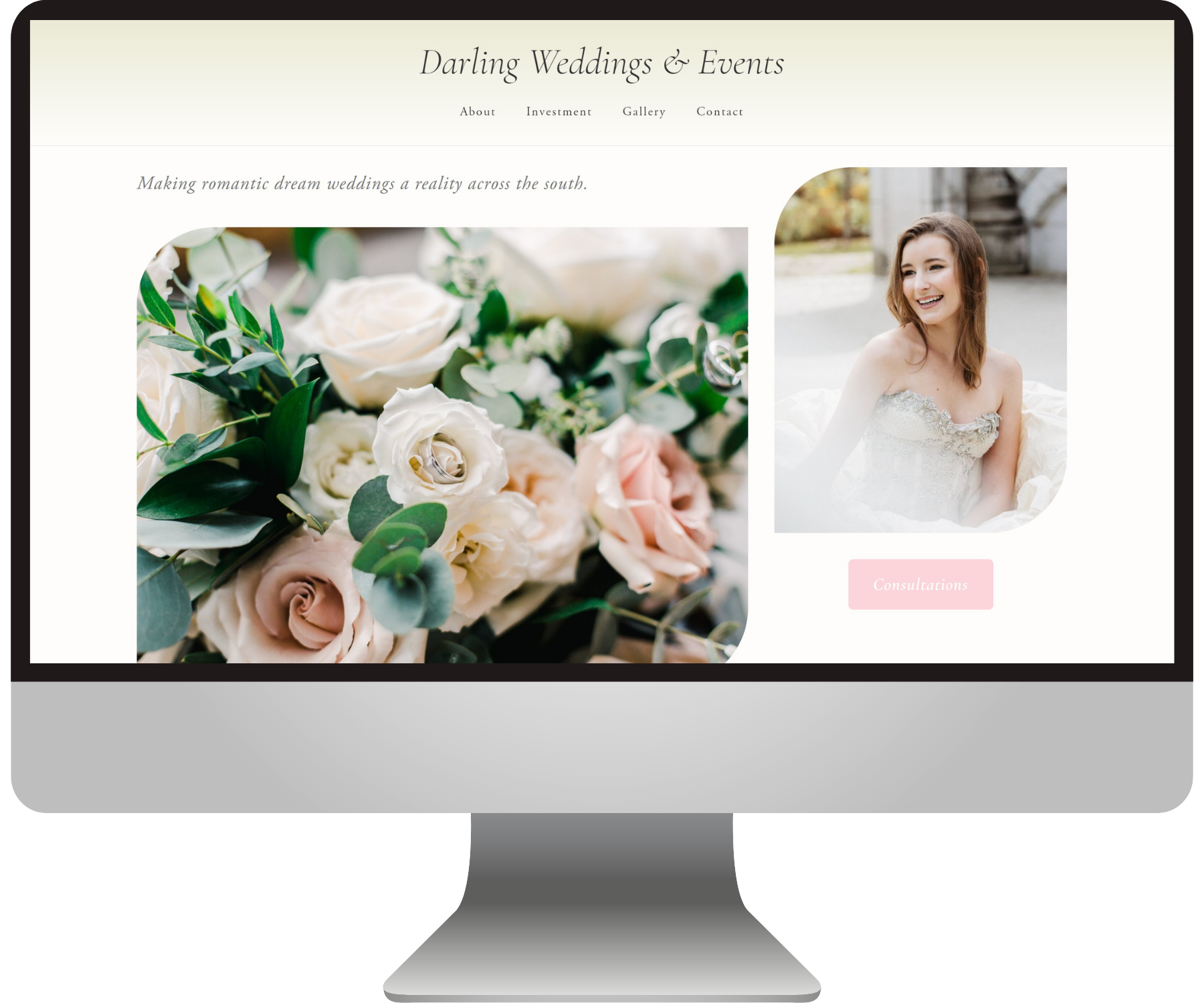
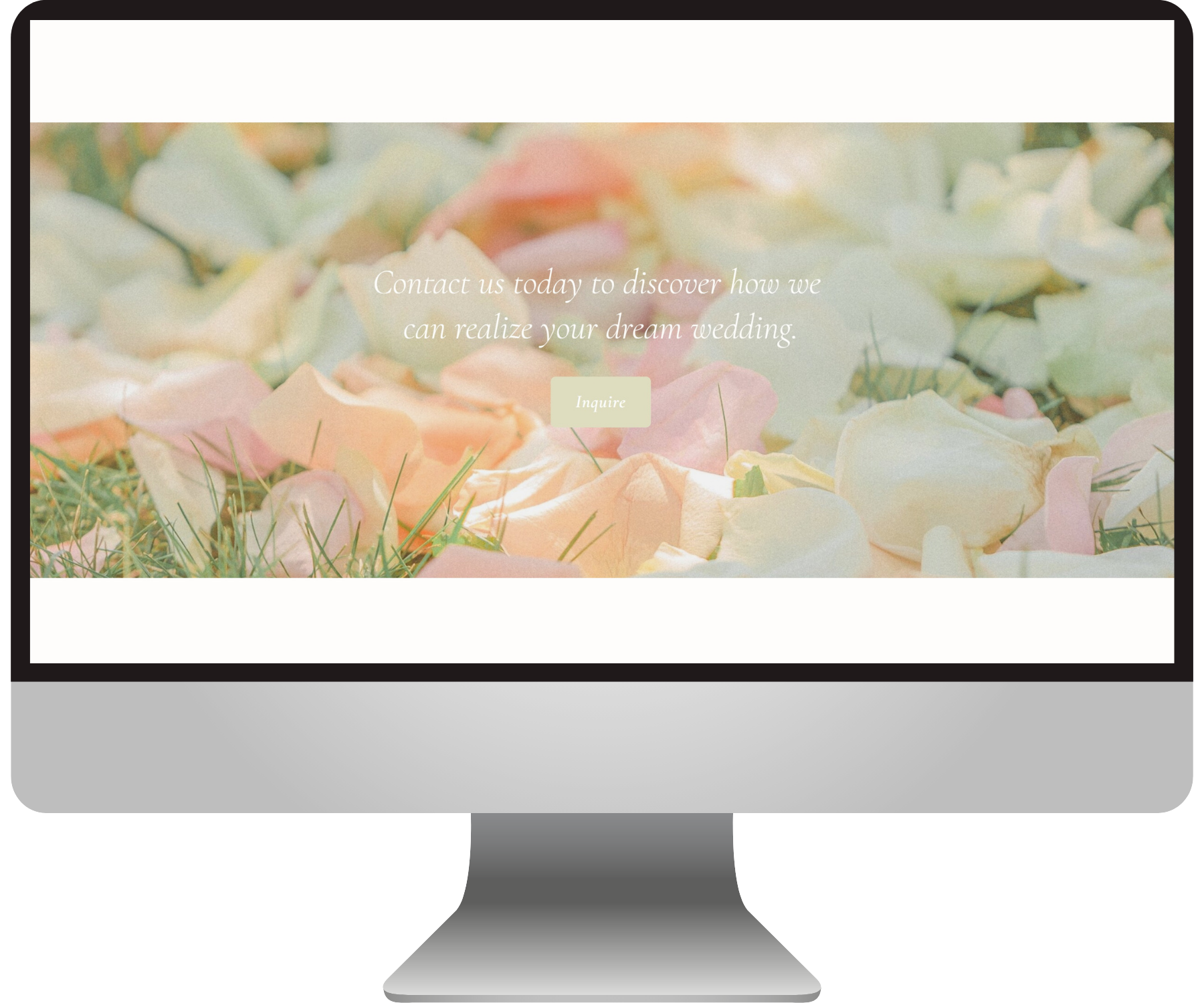
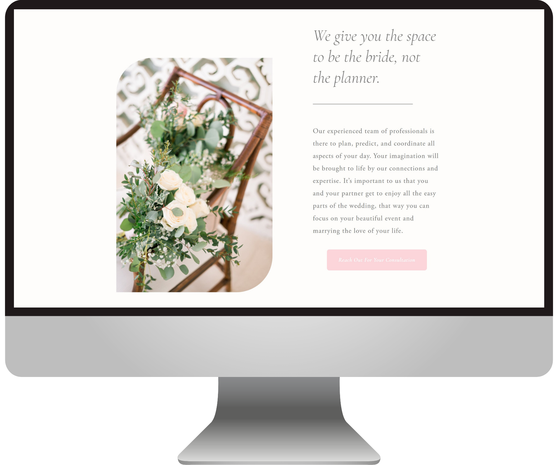
I knew I wanted to create an elegant home page for a planner who favors fine art style weddings. I decided the name “Darling Weddings & Events” would have the appropriate feeling.
I wanted this brand to feel delicate, romantic, feminine, and a little bit southern.
Having this established was SUPER important for the next step.
Set yourself up for more of the right client leads:
Choose photos that are consistent with your specialty.
Notice how I didn’t just use ANY photos from a wedding; I only used images that had the correct vibe. I kept in mind my brand descriptors when curating: “delicate, romantic, feminine, and a little bit southern”.
I know it can be really hard to be this picky with showcasing your work, but remember that you can show the rest of your work on your blog, your portfolio page, or your Instagram (if you really think it will help you get more dream clients).
If you don’t tighten up the visuals - especially on your home page - then your website visitors won’t be able to tell what you do best and whether or not you’re perfect for them.
Plus, it just muddles your website’s overall design when your themes are all over the place.
The easiest way to make a website look professionally designed:
Determine a color scheme & stick to it.
Stick to it like your name is Elmer’s. And I’m not just talking about the actual colors you use in the design. Your photos too!
In this case and in many cases with my clients, I actually let the photos inspire the color palette for the site. Then I narrow down my image selection to make sure it all fits the scheme.
Now if you have already gone through a visual branding process, then you just need to make sure your pictures match your pre-selected brand colors!
THIS is what makes a website look expensive and thoughtfully put-together! This right here people!!!
Sorry I’m not yelling at you… Just very animated…
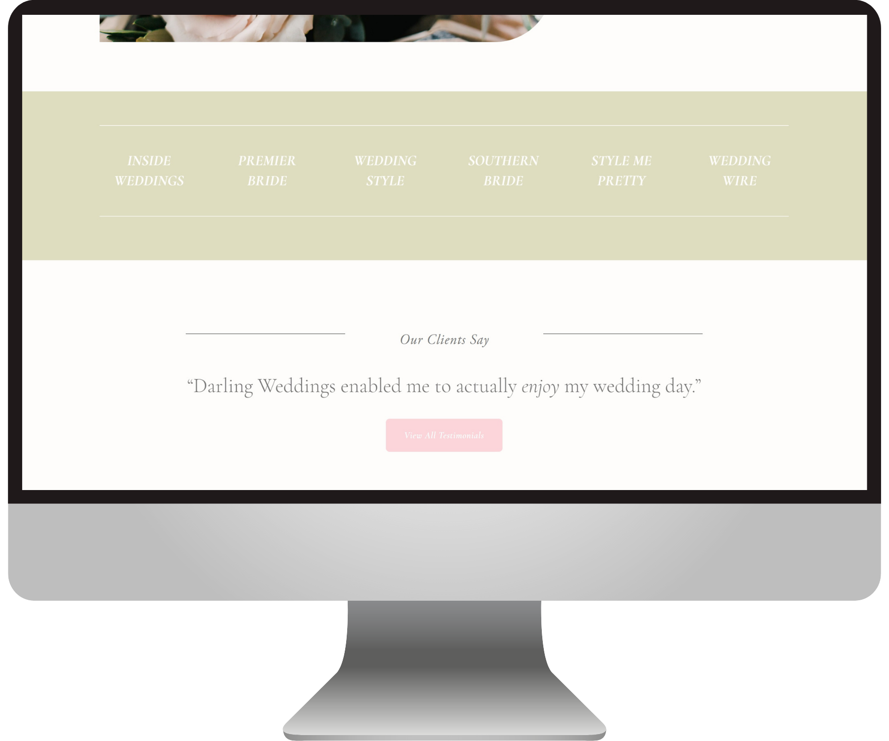
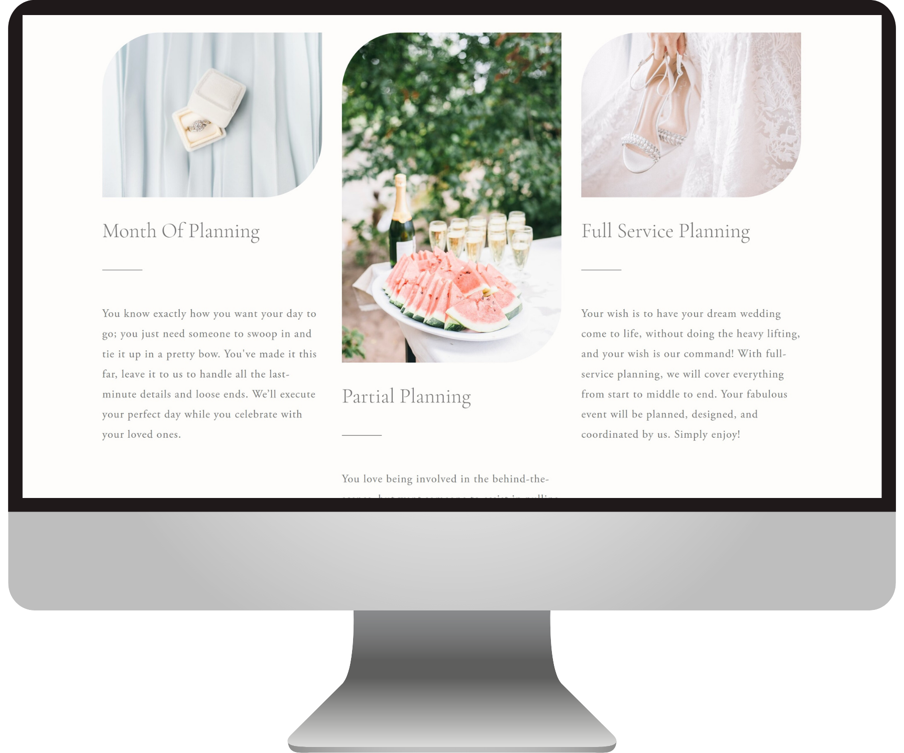
On the Darling Weddings website, you can see how there’s a very clear color palette that each photo I chose adheres to: greens, pinks, and soft neutrals.
All the photos have an airy quality as well. There are no bright colors, super saturated hues, or dark moody tones. So much of this step is about what you choose to leave out.
And again, you can showcase more of your work elsewhere if you absolutely must. But try to get as clear as you can with one specific concept across your main web pages: Home, About, Services.
Tie your website design up into a nice bow:
Pick just 1-3 fonts that match the vibe.
You don’t want too many fonts, because that can look cluttered or unpolished. You just need a couple that support the overall atmosphere you want to create.
If you’re not sure which fonts will do the job, think of descriptors for your brand and do a Google search for fonts in that category.
In my example, I could look for “fine art paragraph fonts” or “formal heading fonts”. That will give you tons of ideas!
Remember, you can always italicize or bold certain lines of text to create some differentiation!
in summary
If you can come up with a clear & concise concept for your style, colors, and fonts; then your website appearance will rise above most of your competitors. :)
Here’s another close-up look at this lil passion piece of mine:
I wanted to break down this project with you because it’s a fairly minimal website design yet it’s effective.
I’d love to hear your comment below if you gleaned something from this little study! 😊