The #1 way to keep people on your website (a factor that many top designers ignore)

We all know SEO is vital.
And the secret to moving up in the ranks on Google is extending your session length - that’s the amount of time visitors stay on your website before clicking off.
Can you guess one of the fastest ways to mess up session duration?
Legibility issues.
If your text is too hard to read, visitors (especially newcomers that you work so hard to get more of) are much more likely to look for the same content elsewhere.
Sad. ☹️
You straight hustle delivering valuable information and inspiration, so you definitely wanna make sure visitors can consume and absorb it all!
Have you ever landed on a high-end blog post or opened up a beautifully designed email, only to have to squint and strain and hold the screen close to your face, maybe even zoom in, and all of the sudden you’re channeling your grandmother??

← me right now
It sounds silly, but it actually happens a lot, when people prioritize pretty over purposeful.
It’s absolutely awesome to break up your blog posts with headings, lists, and images; but what so many people neglect is how the actual font itself is functioning for them.
Yes, you want the elements of your brand to look amazing and attract your ideal audience, but never at the expense of what matters: serving up the content.
how to make sure your website font is highly legible
Choose a font that’s easy on the eyes
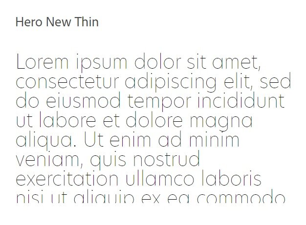
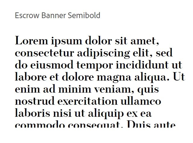
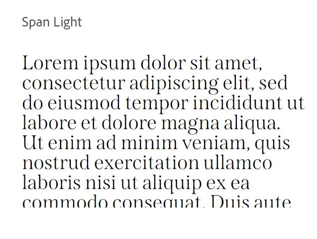
This is especially important for your body font. It needs to work at a relatively small size and in paragraph chunks. We’re gonna be seeing a lot of this font so let’s look at some example comparisons.
Whether you go for a serif or sans serif, just make sure the font carries the right balance of elements for the task at hand. Not too thick, not too thin, and not too detailed.
Body fonts that work well:
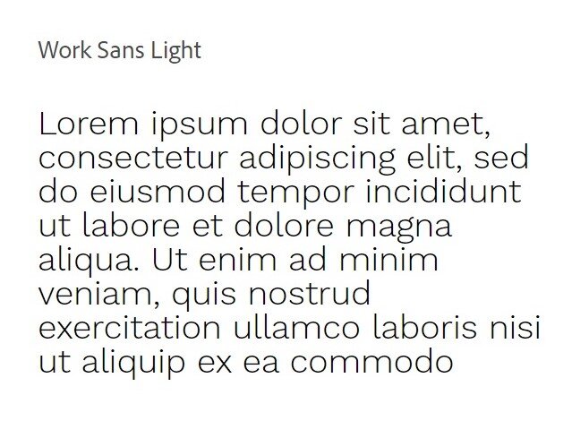
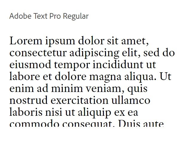
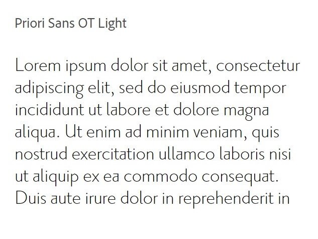
Fonts that cause more strain:
(All these fonts are available inside of Squarespace!)
Pick a comfortable font size
This one right here is the biggest killer of mobile sites. If I have to pinch and zoom on my phone in order to read something, I’m already annoyed 😝
The recommended font size on mobile is 16px, and 16-20px on desktop.
Since Squarespace is a responsive platform, this is SUPER important. Just toggle the display between mobile and desktop in the back-end of your website. Then test it out on your phone just to be sure!
Improve the spacing throughout the text
Sometimes a font becomes way better at a small size just by increasing the spacing between each letter.
In Squarespace style settings, you can adjust the letter spacing and the height of each line of text. Try it out and watch the font transform! Just be sure not to go overboard 🙂
Check out the difference spacing makes with the same exact font and no other alterations:

← Tight spacing

← Average spacing

← Wide spacing
Make sure to have enough contrast in colors
For example, a medium grey font on an off-white page can be very delicate and soothing in terms of design, but not exactly the most practical for long-form writing.
You may be able to read the text at a glance, but if someone is reading your page for an extended amount of time, the text can start to fade into the background and become tiring on the eyes.
It’s best to have high-contrasting colors so users don’t have to strain and be distracted from the content.
Low contrast

High contrast


And if you want to go the extra mile, you can test your colors against a color blindness simulator.
It’s possible that 1 out of 20 visitors to your site are affected by some form of color blindness.

Photo from uxdesign.cc
You can download an app at colororacle.org that will filter your screen through different variations of color blindness. You may be surprised at how difficult it becomes to read your text!
Be honest, now that you’ve thought about these different elements, is there something you might could improve on in terms of making the reading experience easier for your audience?