Portfolio: Spunky website makeover for an expert copywriter

The client:
Canadian copywriter, Natalie Gates
Since 2016, Natalie Gates has worked in marketing and journalism; and now she focuses on website copy for small businesses. She’s a wiz at combining creativity, psychology, research, & culture to create joyful wordsmithery!
I actually worked with Natalie on my own website copy because I absolutely love how she can draw out someone’s personality in their writing - and now it was time to update her website’s design!
Peep the mood board for this project, complete with Nat’s super cute brand photos:

The Goal:
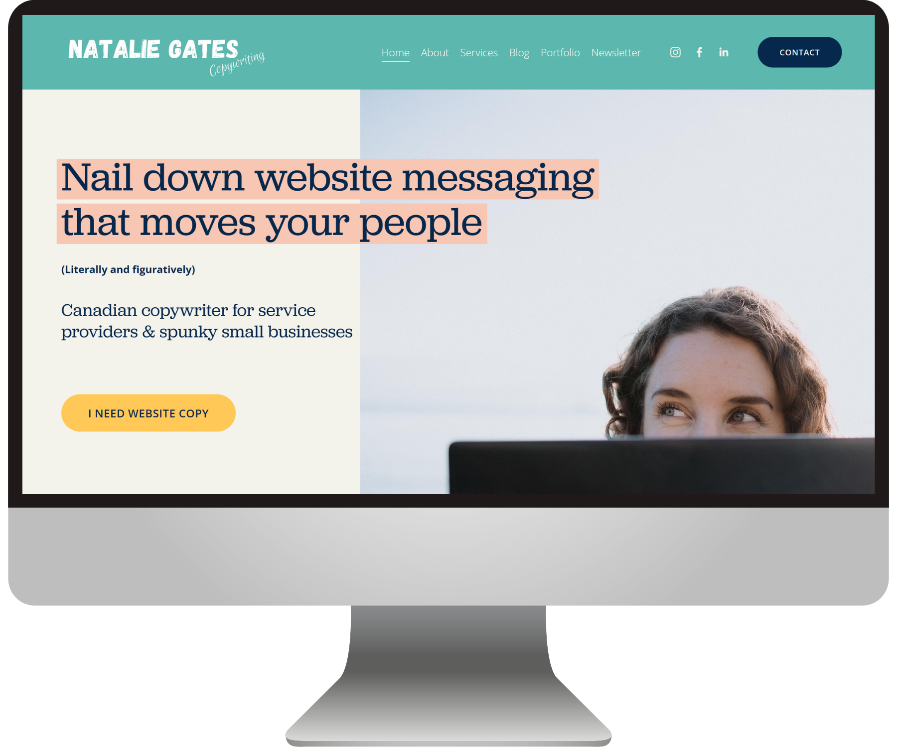
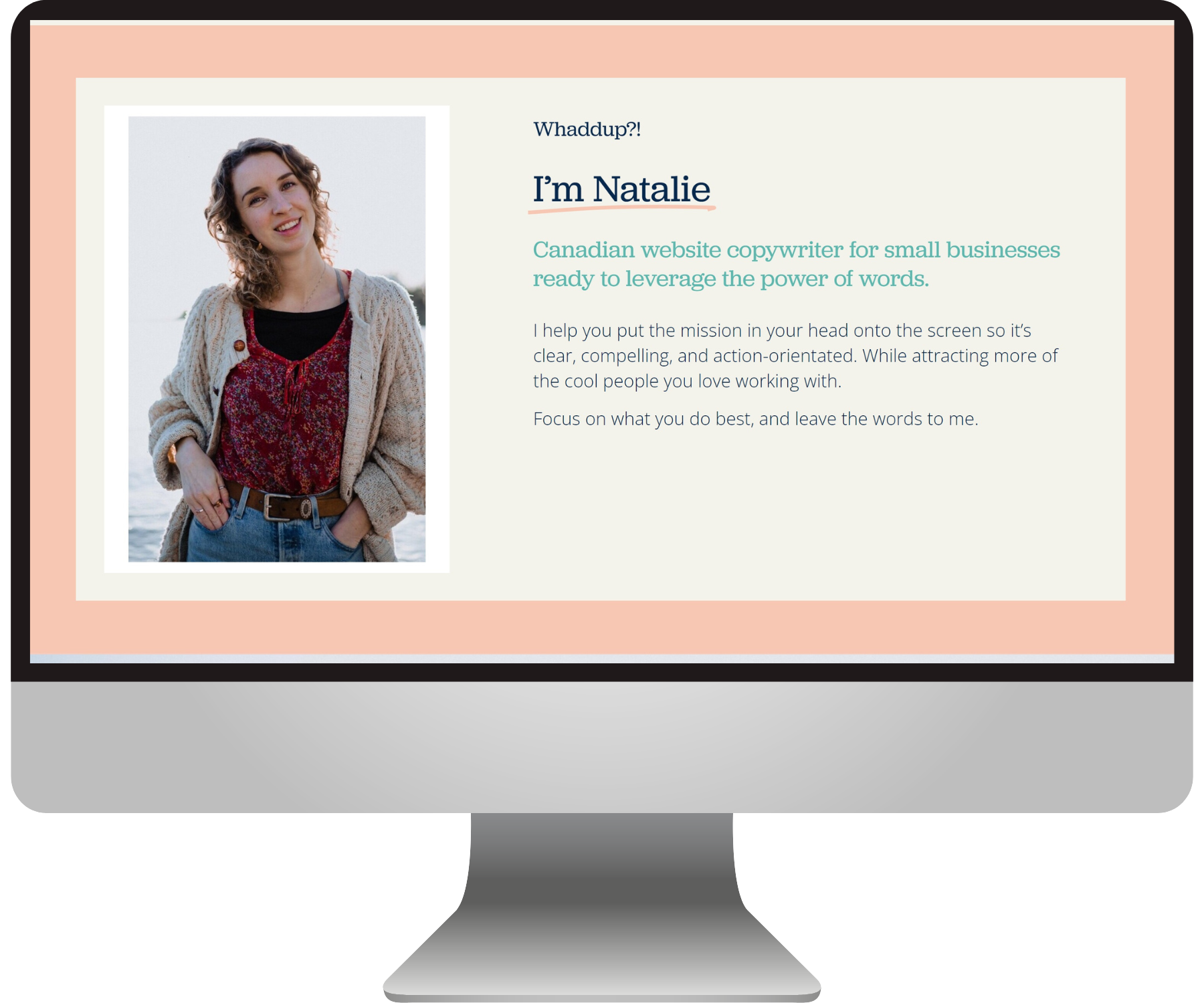
appear professional, yet definitely unconventional
Natalie had built her Squarespace website herself over the years and while she loved it’s bright colors and quirky voice, she wasn’t 100% sure it was as refined as it needed to be in order for her to be taken seriously.
So we started by creating a bright-but-tasteful color palette that would accentuate the teal of her logo, without creating a color clash and giving people a headache.
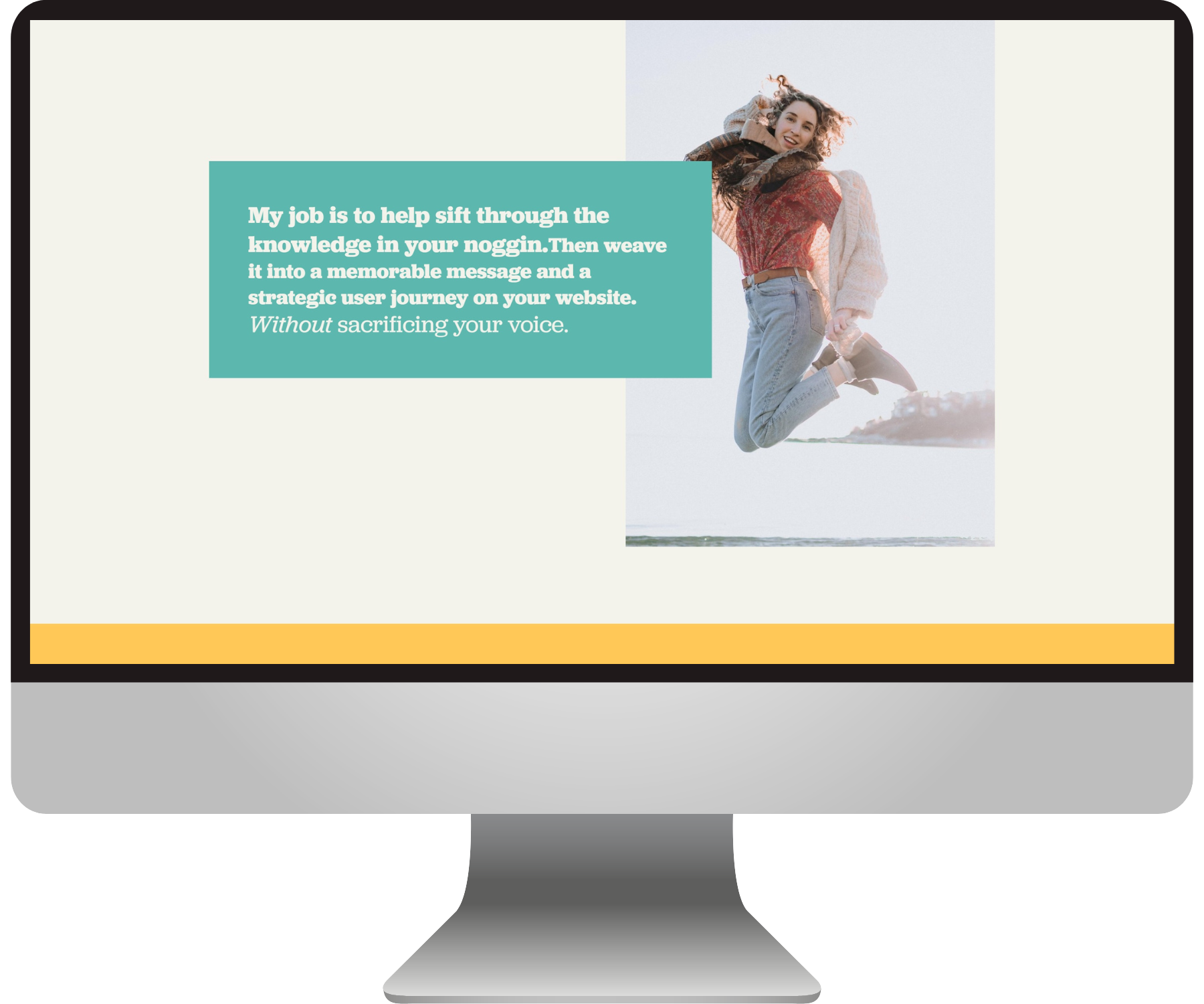
One of my favorite ways to make a website design a *touch* more interesting is to use something other than black as the main text color. In this case we loved how the navy blue added another color to this palette, without it being overwhelming!
We used soft neutrals to break up the bright colors, and used a loud yellow as the main call-to-action color, so that those “click me!” buttons would jump out at ya :)

The solution:
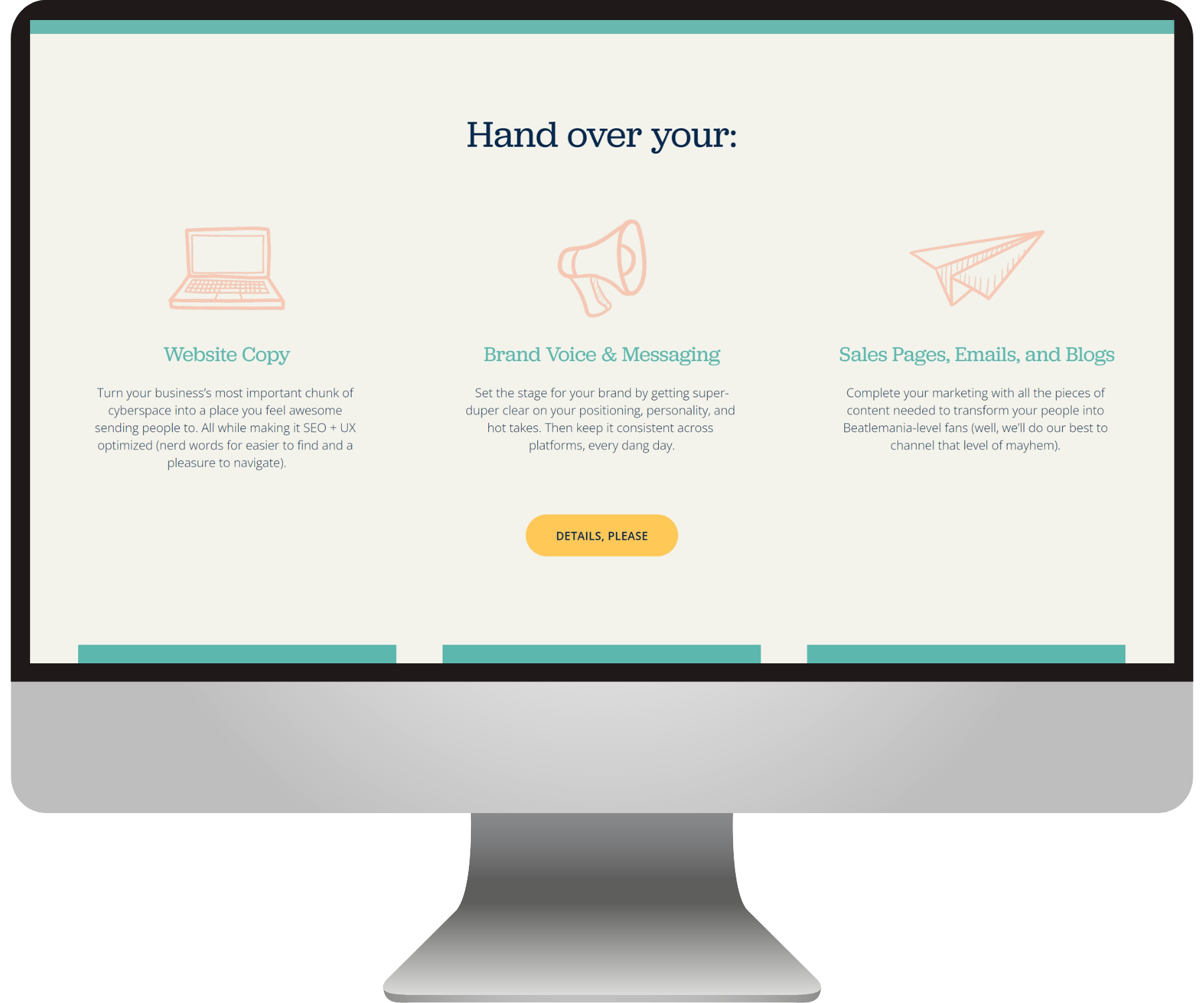
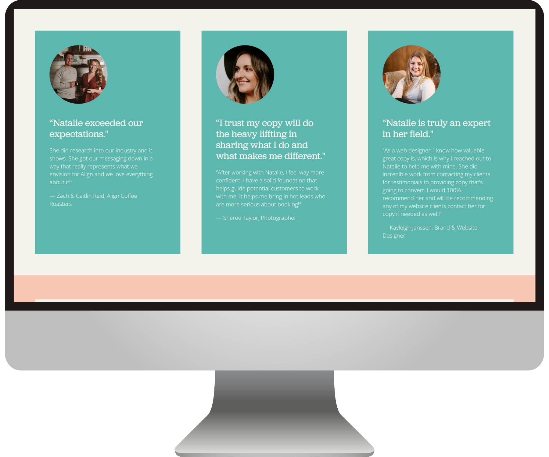
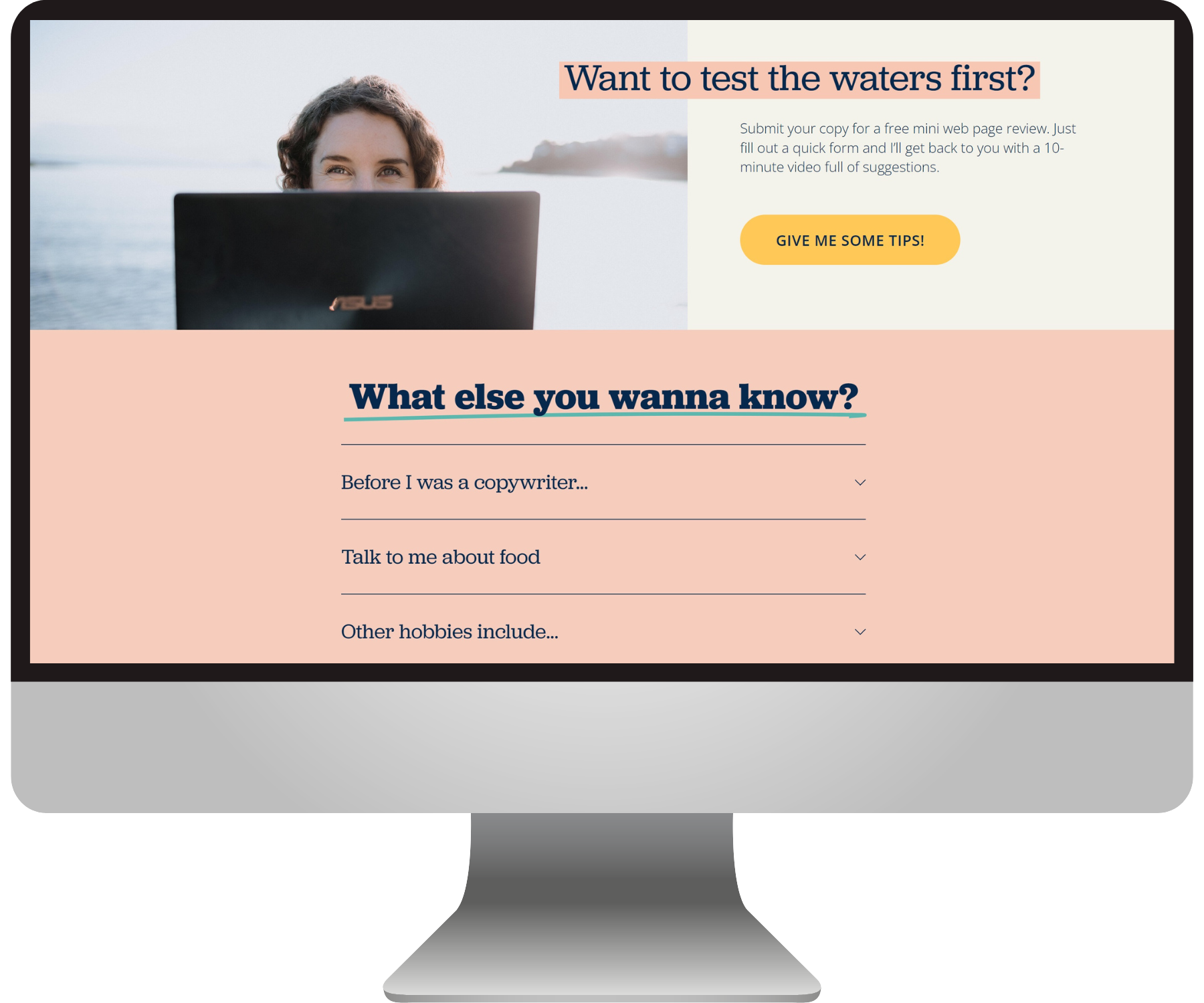
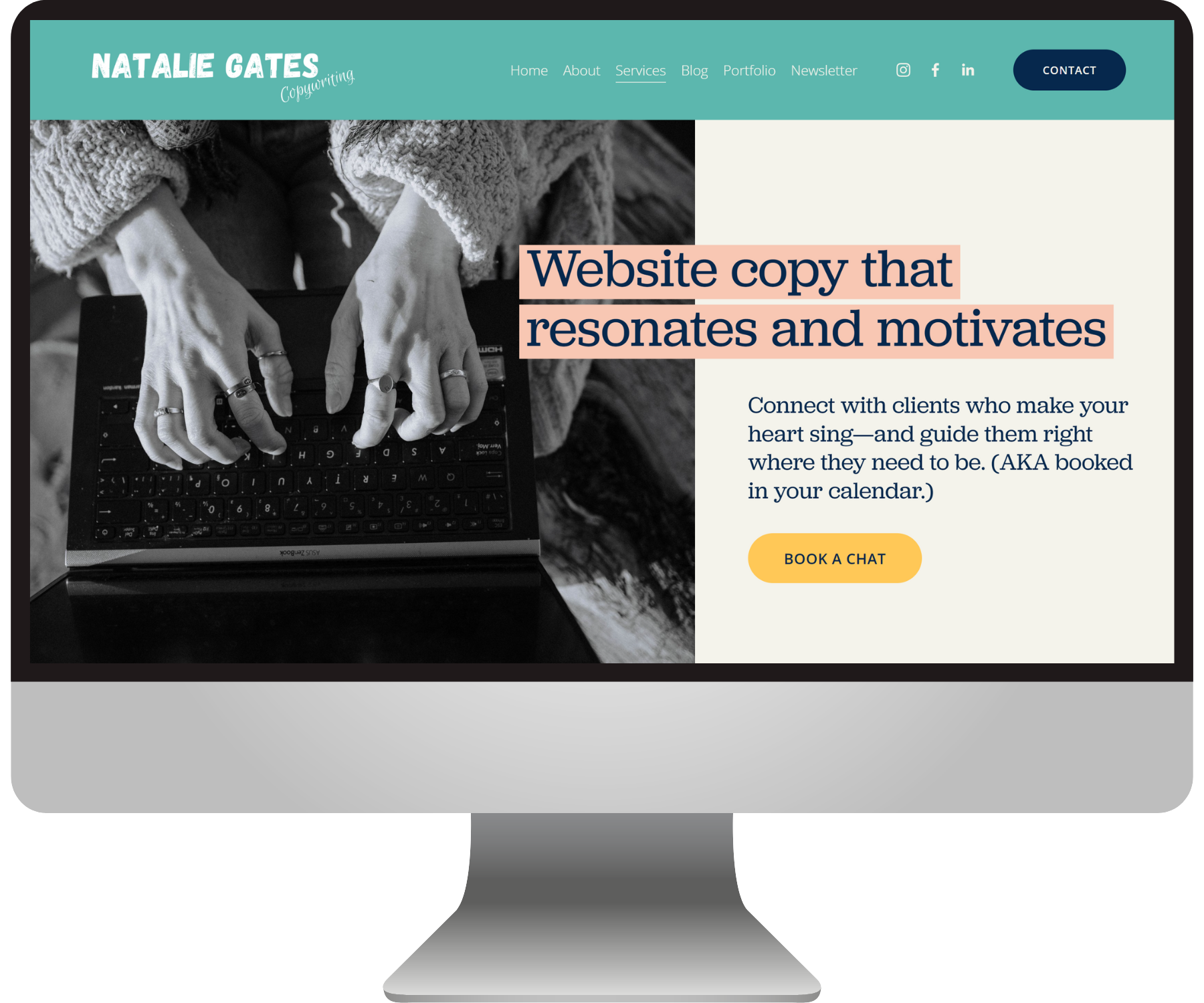
playful but polished website design
Natalie wants to be perceived as a trustworthy expert who definitely knows what she’s doing, but not too buttoned up or stuffy so as to intimidate or bore her potential clients - that’s for sure. So we needed to create playfulness in this design, while still maintaining Marie Kondo levels of tidiness.
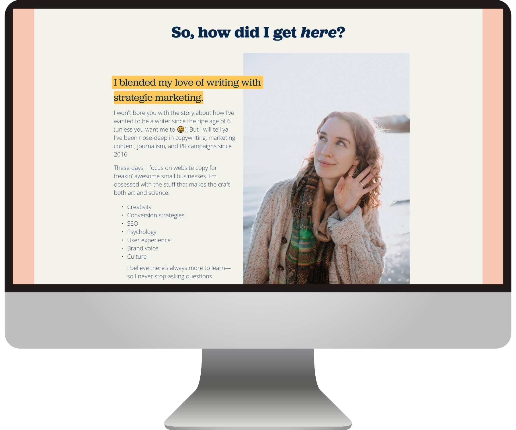
Her quirky brand imagery + the fun elements like text highlights & hand-drawn icons definitely add to the chillaxed vibe that she portrays through her words.
We also used a typeface that’s reminiscent of a typewriter font, yet still has a very approachable air :)
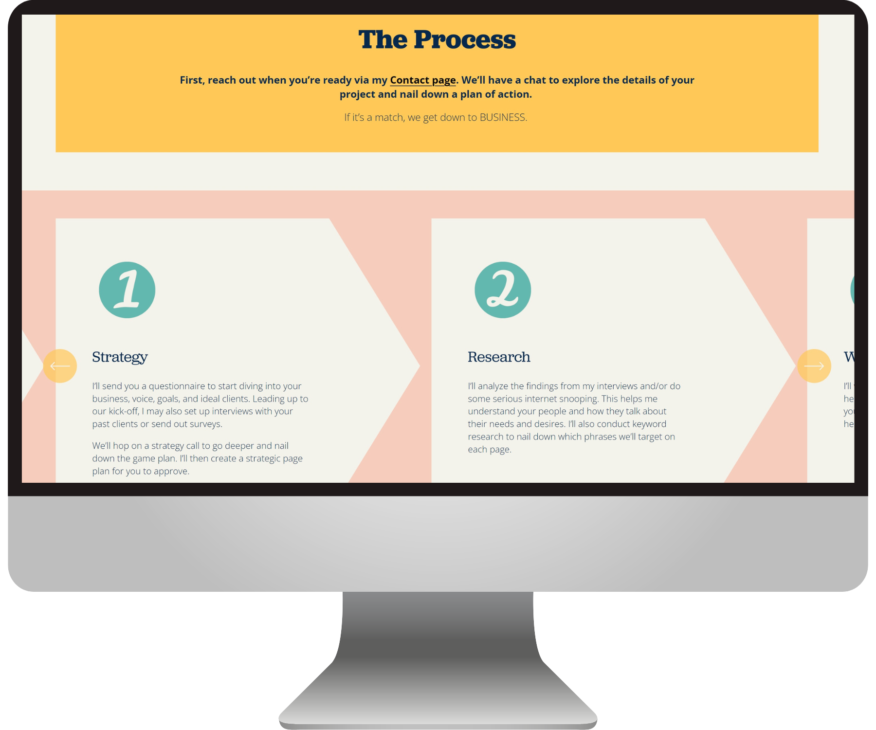
Feast your eyes on some close-ups of our final design below:

Here’s what Natalie had to say about her new website :)

“Somehow, Emily took my jumbled ideas and created a professional website that feels and looks amazing (aka way more official) while totally capturing the fun, quirky vibe I was after.
After DIY-ing my web design for a few years, I was starting to cringe when I looked at my website. I wanted to show up in a way that felt more elevated and cohesive without sacrificing my personality or blending in… I’m actually excited to send leads towards it now. Thank you, Emily!”
— Natalie Gates, copywriter
Check out more BEJ web designs here: