
Mobile optimization checklist for wedding pros
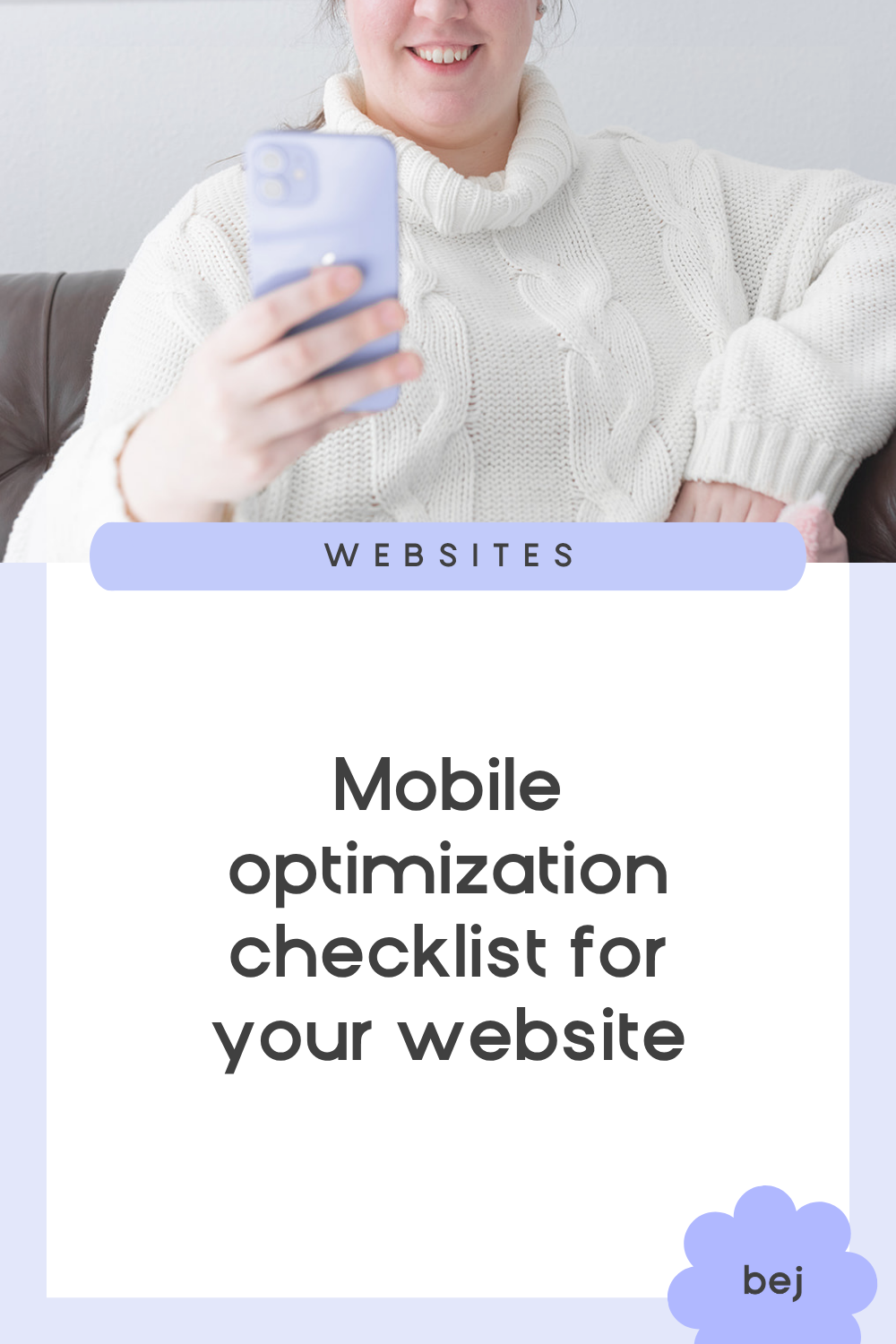
Fun fact: Most people aren’t browsing on desktops anymore.
Yup, according to Global Stats, over half of global web traffic happens on mobile.
This means your future clients are probably spending more time planning their weddings on their phones over their computers.
They’re likely on their phones scrolling #weddingcolorpalettes on Instagram, watching money-saving hacks on TikTok, pinning dresses between meetings, and scrutinizing wedding vendors via Reddit reviews.
That means the way clients experience your website on their phones shouldn’t be an afterthought.
It deserves serious attention on its own, because if it's not done right, you could be turning away potential clients without even knowing it!
In this article, we’ll go over some mobile optimization tips that’ll help your website visitors use your mobile site with ease - and actually book you.
If you’re on the move, you can listen to my podcast interview with Luci Dumas (The Profitable Photographer) or just keep reading for the quick and easy tips below!
So…what do people really want in a mobile experience?
Sadly, making your mobile site great isn’t just about squeezing your desktop site onto a phone.
Why?
Because different devices represent not just different screen sizes, but a different set of expectations and habits.
When we’re using our phones, we’re constantly switching between apps and moving quickly. We also don’t want to think too hard about what we’re looking for. Simply put, we’re all a little less patient when we’re using our phones to browse.
And it doesn't take much to lose them. We're all busy - with life, work, and yes, even our socials - so even a small inconvenience (like cluttered menus) can be enough to make someone click away.
This happens on desktops too, but far more on mobile, because in our minds, mobile is supposed to be fast and easy.
So what do we do?
Well, we have to give them what they want: Simplicity and Speed.
Of course, in reality, it's not that easy!
As a business, we still need to sell ourselves. And fitting everything you want to say and showcase into a clean, easy-to-navigate mobile experience can be a real challenge.
The real art of mobile optimization is finding that sweet spot between simplicity and persuasion.
So let’s talk about the best ways to do that.
Here are 8 “No-brainer” Mobile Optimization Hacks for Wedding Pros
1. Design for scrolling, not clicking
When someone lands on your site from their phone, they’re more likely to scroll than click.
That means your homepage should be scrollable.
Think of it like a poster of your entire business - one continuous flow that tells your story from top to bottom.
A visitor should be able to land on your homepage, scroll through it, and walk away knowing exactly who you are and what you do.
To make that happen, focus on these essentials:
• A short but sweet intro
• Standout select photos
• Summary of what you offer (your main services at a glance)
• A clear way to contact you
Keep it simple and scannable, while giving them enough information to get a decent understanding of your business. Because here’s what you have to remember: your homepage might be the only page they ever see.
2. Clarity over creativity
As someone in a creative industry, we often feel the urge to get super creative with everything - from the layout to the graphics to the names of our pages.
Instead of “About,” we go for something catchy like “Behind the Magic.”
Instead of “Services,” we try to hook them with “Your Forever Story.”
But this is actually counterproductive; because when it comes to websites (especially on mobile), clarity beats creativity. Every single time.
So when it comes to naming pages, always stick with simple, familiar labels like:
About • Services • Gallery • Contact
They may not sound exciting, but visitors instantly know what they’ll find. And trust me, that’s what they want. They don’t want to think or guess!
In terms of design, your main menu should have as few links as possible and each one should be immediately obvious. If visitors have to think about what a page name means, they’re far less likely to click.
That doesn’t mean you have to be boring. You’re free to get as creative as you want…but save the creativity for the page content, not the menu labels or navigation :)
3. Keep copy skimmable
Lemme just be real: A lot of websites have massive walls of text that nobody will read.
That’s because these days, people are juggling a lot, and reading long chunks of text on a website just isn't how most of us consume content anymore.
If you want readers to actually read, make your copy easy to read through!
How do we achieve that?
Use short paragraphs – 2-4 sentences max. Beyond that, the reading starts to feel like homework.
Add headings and subheadings – they guide the eye and help readers find the info they actually care about.
Include bullet points – highlight key details at a glance.
Break up text with images – images prevent overwhelm.
Your copy should give visitors just enough info to help them feel comfortable taking the next step, which is reaching out or booking a consultation.
4. Put your contact info on every page
Again, we’re aiming for elementary-level ease, especially with how they reach out to you. So when it comes to your contact info, don’t just make it easy to find. Make it super easy!
That means you’ll wanna include it at the top of the page, the footer, and perhaps even in the middle of the page.
You can also implement a “sticky navigation” so the main menu sticks to the top of the page as users scroll.
Trust me - it's perfectly fine to include your contact info more than once on a page. Most visitors won't even notice. What they will notice is when they can't find it at all.
5. Put your business info on every page
Besides your contact info, another thing that must appear on every page is your business info.
I’m not talking about a full About section, just a short line with your name, location, and services.
For example:
Miranda Kaye – Wedding Videographer – Los Angeles orAndrew Smith – Wedding Planner – New York
Why is this important if it seems kinda obvious?
Well, for one…website visitors want confirmation that they didn’t land here by mistake, so it’s good to verify: Yep! You’re on a wedding planner’s site. Her name’s Miranda Kaye, she’s from LA.”
Two, it’s just as important for SEO. The robot overlords (aka Google) love seeing this info clearly because it tells them exactly who you are, what you do, and where you’re located. That helps your site show up in relevant search results.
And since this should be clearly visible on every page of your site, the footer is a strategic spot for it.
This is just one of many small tweaks that help Google find you.
If you want to level up your SEO further, grab my free Quick SEO Fixes guide:
A checklist of easy changes that make a big difference on your wedding business site.
6. Have clear CTA at the top and bottom
One of the biggest mistakes I see on wedding pro websites → not having clear calls to action (CTAs).
I’m sure it’s because you’d think visitors will just know what to do. But they usually don’t!
A CTA is typically a button that’s easy to spot and shows the visitor exactly how to get started. That might be something like “Give us a call” or “Fill out our contact form” or “Inquire here.”
The key, once again, is clarity. Your visitors should immediately know what action to take and where that button is sending them.
Place a CTA near the top of every page so it’s visible right away. Then, include one at the bottom so it’s easy for them to do the next step as soon as they’ve learned more about you (instead of making them scroll back up).
7. Contact forms should feel effortless
Your contact form should be super easy to fill out. If it feels like too much work, visitors will just keep it movin’.
Don’t make them pinch and zoom in. Fields should be big enough to tap and type into comfortably on a phone.
Keep the questions minimal. If you have more than 10 fields, you’re significantly reducing the chances of someone completing the form. Aim for 4-5 max if your goal is to get more responses. (Your contact form shouldn’t feel like homework or an interrogation.)
Make phone numbers optional. For some people, that’s too much too soon. Others simply don't want to receive calls from businesses at all (even from the ones they like). Don't let a required phone field be the reason someone abandons your form.
8. Pop-ups should be very easy to close
Remember those loud, flashing pop-ups from the early days of the internet?
Yeah…those were fun in 1999, but they don’t fly anymore.
That doesn’t mean all pop-ups are bad… When designed with the visitor’s experience in mind, they can actually work.
If you really want to use pop-ups, just remember these two rules:
Use them sparingly. Ask yourself, ‘Is this pop-up really useful for the visitor?’ Get a second opinion (preferably from someone who knows UX) if you’re not sure.
Make them easy to close. Don’t hide the X off in a corner or make it so small they might need a magnifying glass. If you do, the user will get frustrated and just close your site altogether.
To Wrap Things Up…
The secret to mobile optimization isn’t fancy design or clever SEO tricks.
It’s making things super easy, even when you’re trying to sell yourself and your services.
The goal is to keep it simple, but not too simple. Clear, but not boring. Persuasive, but not overwhelming.
Find that balance, and your mobile website will actually start converting visitors into clients :)


