Essential website pages for your wedding business (and two pages you actually don’t need)
If you work in weddings, you already know this: but you're dealing with some of the most discerning clients out there.
Sometimes they're the ones with crossed arms and raised eyebrows - open to being impressed but very quick to walk away.
Fair enough; because they're shopping for one of the most important days of their life, using thousands of dollars they worked hard for!
Besides, they've probably read so many horror stories on r/weddings about vendors who don't deliver…and of course, they don’t want that - they want their big day to be perfect.
The first place they size you up? Your website.
So if you're a wedding photographer, a wedding planner, or any kind of wedding supplier, I get it if you feel the need to give your website all you've got.
That’s awesome. But when it comes to designing websites: "giving it your all" doesn't actually mean MORE.
In this article, I'll share what pages your wedding business website actually needs… and which ones you can totally skip ;)
If you’re on the move, you can listen to my podcast interview with Serena for Swell Social Hour or just keep reading for the quick and easy tips below!
The five essential website pages:
The Homepage
When you think of your homepage, imagine you’re literally welcoming someone into your home.
You open the door, smile, and say, "Hey, come in!" Then you ask them if they want coffee or tea. You offer them a seat. You introduce yourself quickly.
What you DON'T do is fling the door open, shout an over-eager "WELCOME!", and immediately show them your 300-page photo album while delivering a dramatic monologue about your life.
The latter would send them running to your door - and in digital terms, that's dangerously easy (it's just one click of the X button).
What’s the lesson here?
When it comes to the homepage, just tease!
Don’t give a heavy presentation. Instead, let them get a taste of who you are and what you do so they’d hopefully click through to the other pages.
So how do you actually do that?
Keep your copy skimmable. The moment someone lands on your page and sees a wall of text, they'll just glaze right past it. So make sure to break up big chunks of text.
Be intentional with your photos. As tempting as it is to dump every shot you've taken since 1995, please don’t. Visitors aren't in research mode yet - they just want a quick overview. So give them a great visual first impression on the homepage and save the rest for your services or portfolio page.
For more tips on website photos, listen to my podcast episode with Halima Hanemann where we talk about how to use photos to elevate your wedding website!
One important thing though: even if you're keeping things lean, don't forget your basic info like your location, your email, your main services. Some people are just passing through and need to find what they need fast so they can get back to you later.
The About Page
Your About Us / Who We Are / The Team page is doing more work than you think.
It's one of the most clicked pages on any service-based website, because people don't just want to hire any vendor. They want to know who they'll be working with.
So your About page shouldn't just be a list of your credentials and a summary of what you offer. Let’s go deeper!
What it actually needs to do is give people a feel for who you are: your personality, your values, why you love what you do.
Think of it this way: if your homepage is where you do small talk (the "hey, come in, coffee or tea?"), your About page is when you actually sit down and have a real conversation. And instead of just rattling off your résumé, you tell them a little about yourself. How you got here. What you care about, your greatest inspiration, your favorite things, maybe even your pet peeves, and so on.
That's what makes someone go from "Hmm, okay. Interesting." to "Okay, they’re actually cool and real. I need to work with this team!"
The Services Page
Remember how I said your homepage is all about the tease? Let’s NOT tease folks here on your Services page.
This is the page where you lay it all out. Clarity and specifics are what your potential clients need here.
You see, by the time someone clicks on your Services page, they're already halfway sold. They already like you. So give them everything they need to know to actually book you.
Don't give them something vague like "The Eternal Love Package: includes full day coverage and all the memories you'll cherish forever."
If you're a photographer, it could look something like this:
Wedding Photography – Full Day Coverage: 8 hours of coverage, 2 photographers, 500+ edited photos, online gallery delivered within 6 weeks.
Engagement Sessions: 2 hours, 1 location, 80+ edited photos, online gallery delivered within 2 weeks.
It’s specific, without being TMI. You can always provide more granular details after they reach out. But this helps them make the majority of the decision on their own.
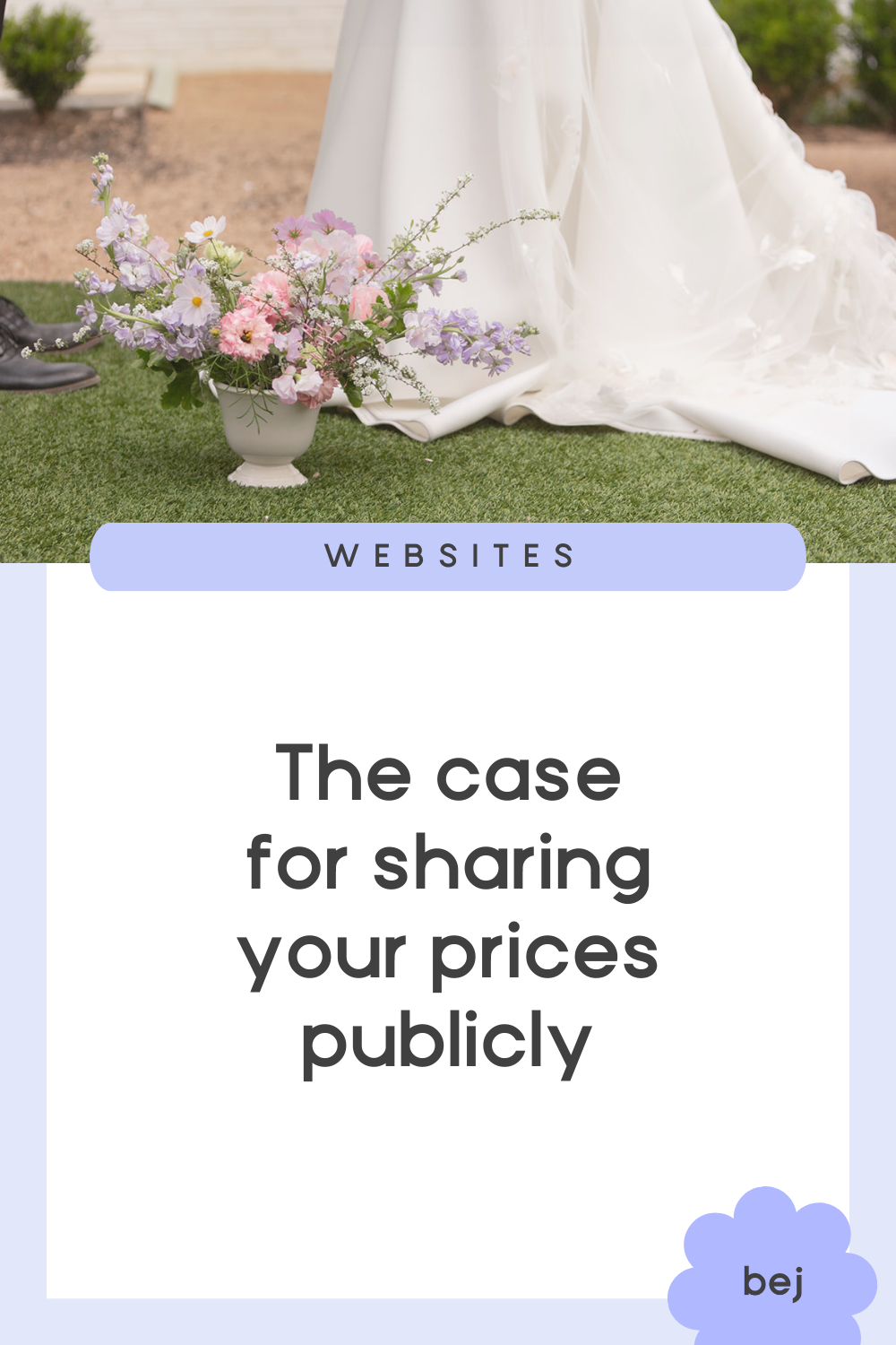
Should Pricing Be on Your Services Page?
There's something a lot of vendors do that I think is unnecessary: keeping "services" and "pricing" as two separate pages.
But why make people click around and connect the dots themselves? That’s added work - for them and for you!
Pricing makes more sense alongside your service details: what's included, what the experience is like, your process, etc. After all, we decide if something is worth the money by getting a clear picture of what we're getting, right?
A standalone pricing page just leaves people staring at a list of numbers, tabbing back and forth trying to remember what they're even paying for.
But... should you really be posting your prices at all?
Some people say don't put your pricing online - that it could backfire, or you'd miss the chance to quote higher. But here's my stance: do it. Be transparent from the start.
I know not every business can publish a neat little price list (planners and florists especially, where every wedding is different). But give people something. If your pricing is truly too variable to list, explain why. Give them a starting price. Walk them through what your pricing is based on. Give them enough to figure out if you're even in the right ballpark before they reach out.
Because the moment someone can't find your prices, they're not thinking "How intriguing. They must be really good." They're thinking "Hmmm, what's the catch?"
And in an industry already plagued by couples fearing they're being tricked, hiding your pricing only adds to that anxiety.
The Contact Page
IMO, a contact link in your header and footer is not enough. You still need a dedicated Contact page.
This is where you put your contact form, of course, but also: your physical address or region you serve. Nothing says we're a real business quite like an actual location people can recognize.
As for the contact form itself, here are some tips that can make a big difference:
Keep it under 10 questions. The longer the form, the fewer people finish it. This is not a theory - it's directly correlated.
Make the phone number field optional. A lot of people, especially younger clients, won't give out their number. Some people just don’t like phone calls. Don't make it a dealbreaker.
Don't assume who you're talking to. Not every inquiry comes from the couple. Sometimes it's the mom, the sister, or another vendor. Ask for their role. Ask for their pronouns. It's a small thing that says a lot about how you work.
Include at least one open field. Give people room to say something you didn't think to ask. They'll have a place to write their questions or a detail they really need you to know.

TWO PAGES YOU DON’T ACTUALLY NEED
After reviewing many websites, I keep seeing the same two pages - and the majority of the time, the analytics show the same thing: these pages get very little clicks.
You might be surprised because they're ones you may have put some real effort into.
So which pages are they?
(drumroll…)
The Testimonials Page
So many wedding pros are tucking their testimonials away on a dedicated page, but sadly almost no one clicks on it.
And that's a shame - because testimonials are some of your most powerful content! They're your social proof, and yet they're buried where hardly anyone will ever find them.
The solution: be strategic with your testimonials by scattering them across your site!
Sprinkle them around where they can't be missed (especially your homepage) and where they're much more relevant.
Say your About page talks about how you take things off people's plates or how organized you are - well, that's exactly where you insert a testimonial from a client who experienced just that.
Or if your Services page describes how you make couples feel at ease in front of the camera, that's exactly where you’d drop in a testimonial from a couple who felt that way.
The FAQ Page
Just like your pricing, your FAQs are best placed right on your Services page too.
Why?
Because your FAQs are almost always directly related to your services.
And since your service page already walks visitors through your process and deliverables, questions will naturally come up around exactly those things while they’re reading your services.
For example, when they're viewing your destination wedding services, a question like "Do you travel internationally?" might come up. Or when they're viewing your pricing, they might wonder "What happens if I need to cancel or reschedule?" So put those FAQs right there, where they're already asking them.
Another smart place to put your FAQs is right above your contact form.
That’s because the questions people are reaching out about are probably the same ones you'd put in your FAQ anyway. So answer them there first and save you both the back-and-forth :)
And really, this all comes down to one simple rule:
the smoother the experience, the better.
So if you have more than eight pages in your navigation, start asking yourself what can be combined or cut altogether. The simpler your site is to navigate, the better the experience - and the better the experience, the more likely visitors are to actually reach out.