Portfolio: Mid-century inspired Squarespace website for a wedding photographer
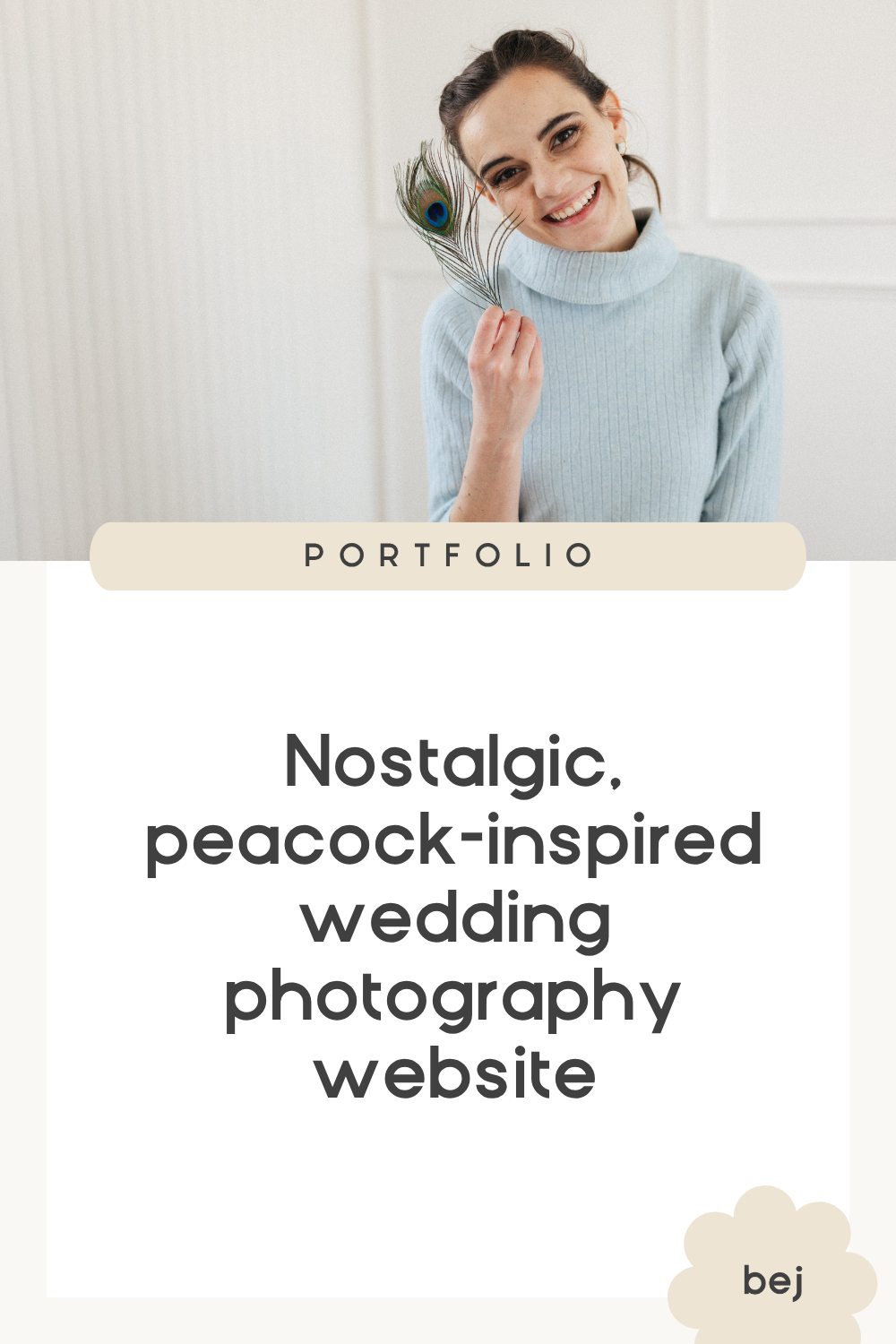
A website for the photographer who notices the little things
Annie Shannon is the kind of photographer who notices things other people might miss.
The way your grandmother squeezes your hand during the ceremony. The inside joke that makes you both burst out laughing during portraits. The relatives who traveled halfway across the world to celebrate with you.
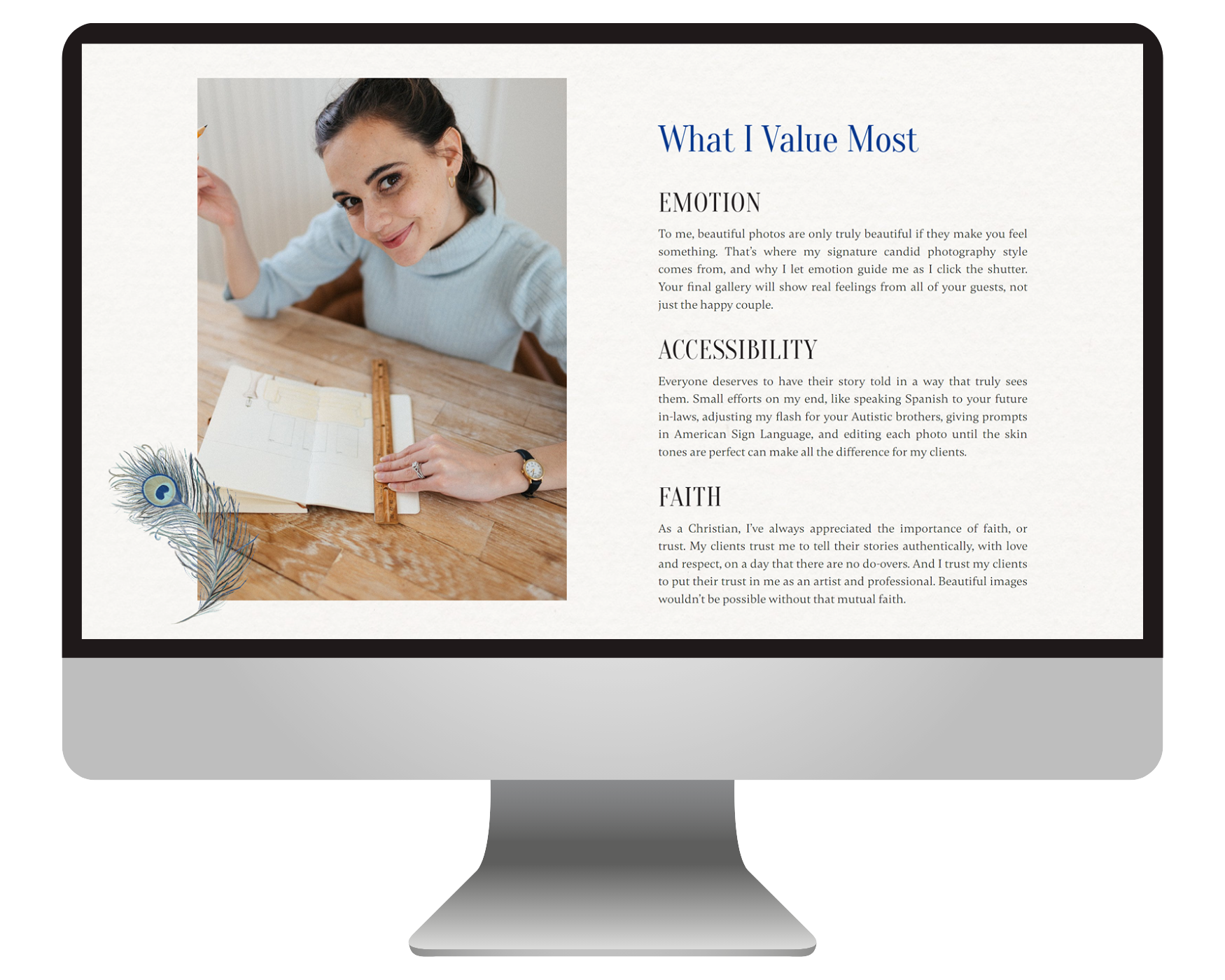
She cares deeply about helping people feel seen, whether that means photographing multicultural love stories, speaking Spanish with family members, or simply creating images that help couples remember not just what happened on their wedding day, but how it felt.
So when it came time to redesign her website, it needed to do more than showcase beautiful photos. It needed to reflect the warmth, thoughtfulness, and inclusivity that make Annie's approach so special.
The website before:
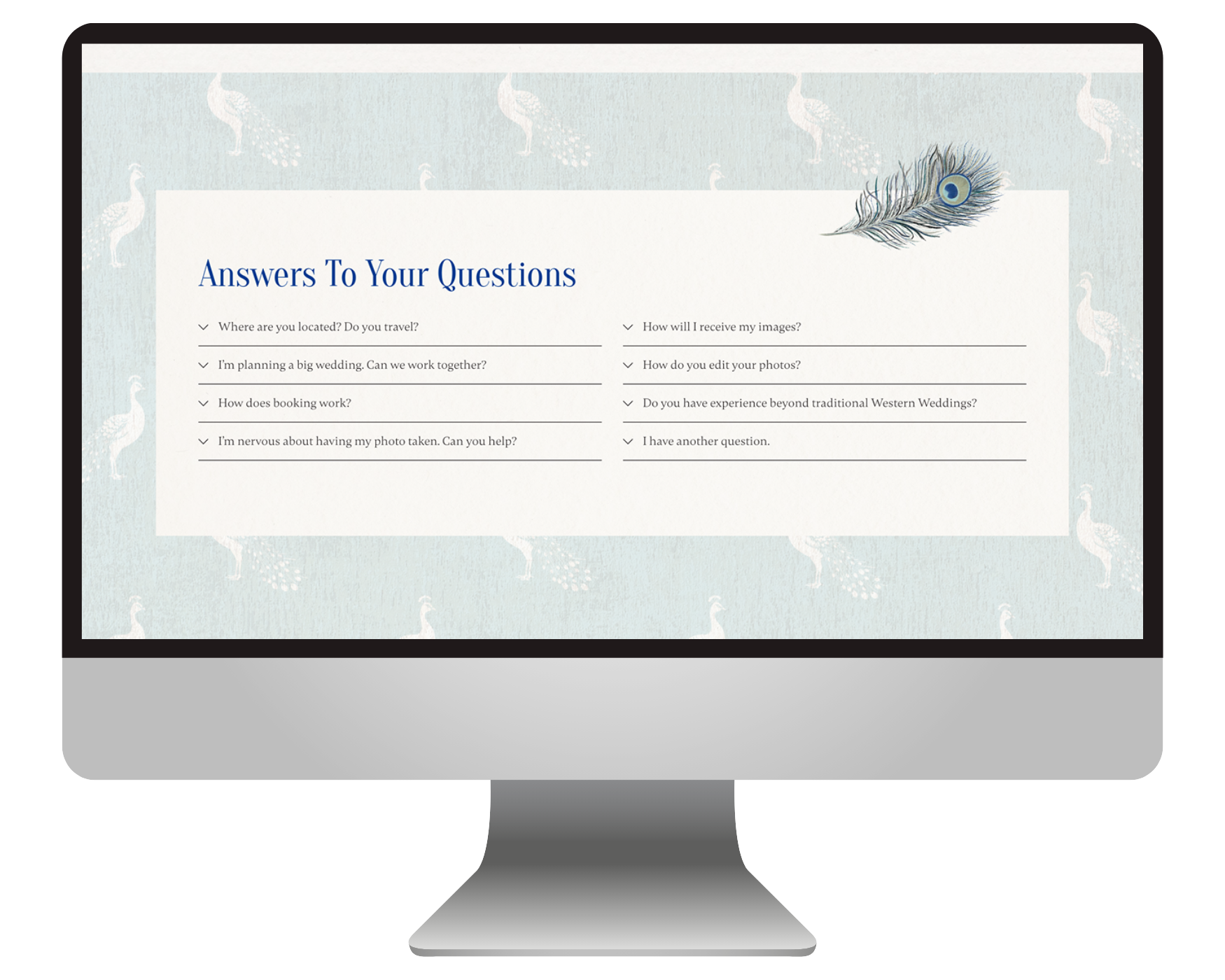
Why this project didn't need a full rebrand
When Annie came to us, she already had a lot of beautiful pieces in place. She had thoughtful website copy by Bigmouth Copy, meaningful brand elements like custom peacock feather illustrations by Naomi Golden Creative and a mid-century-inspired logo by Bri Mahalie, plus a pretty clear vision for how she wanted people to feel when they landed on her website.
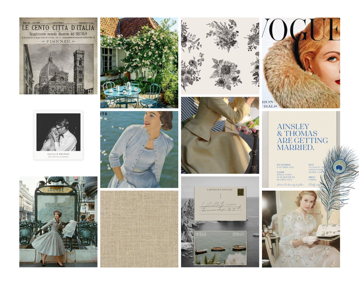
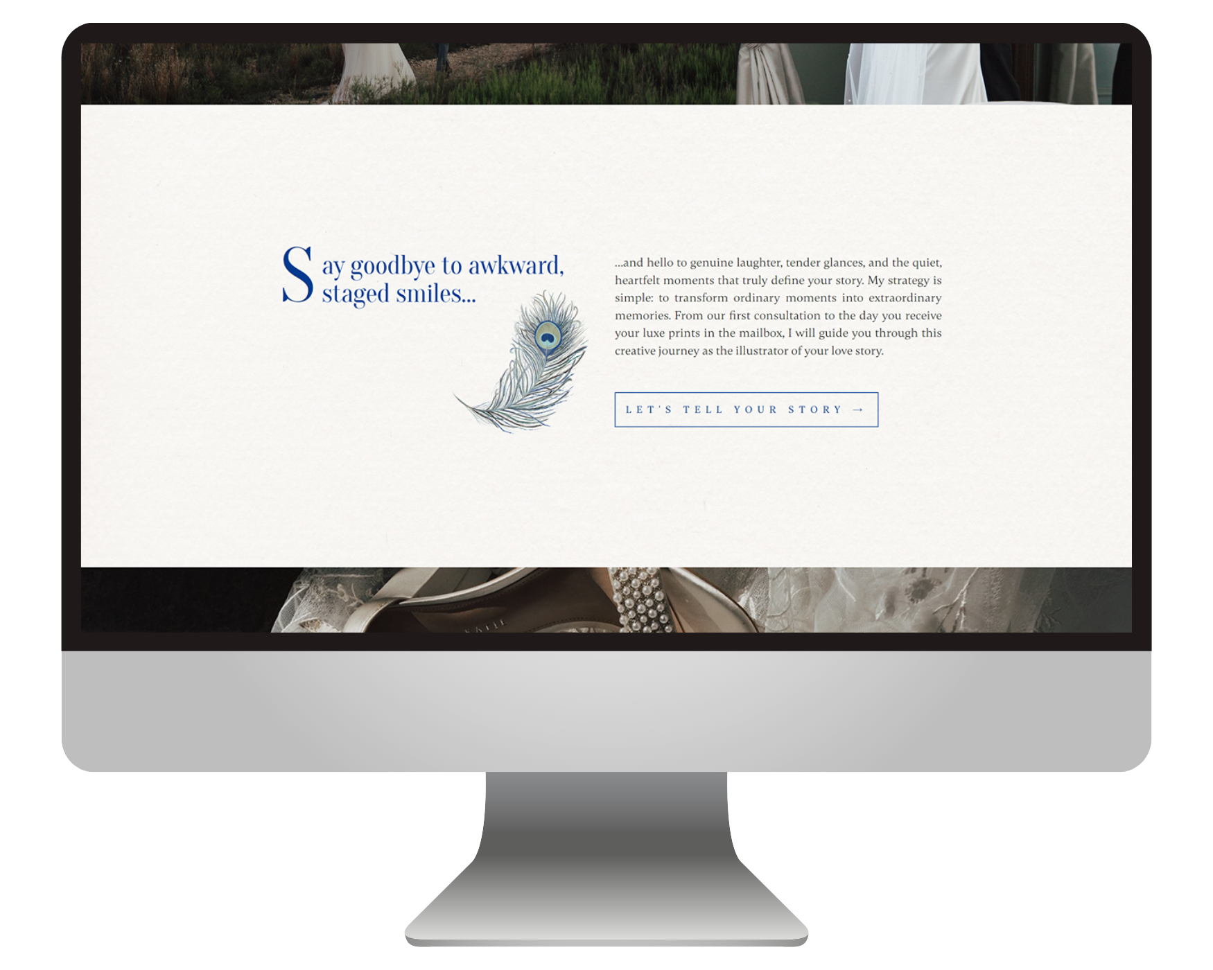
Her inspiration pulled from mid-century design, old magazines, postcards, books, and other nostalgic paper goods. Not in a super literal way, though. The goal wasn't to make the website look like an antique store. It was to capture that same feeling: comforting, timeless, personal, and a little romantic.
As we dug into the project, it became clear that this wasn't a full rebrand situation. Honestly, all the ingredients were already there. The bigger challenge was bringing everything together.
What we noticed instead was that everything felt a little disconnected. The color palette was pulling from a mix of bright, muted, warm, and cool tones. And while the existing layouts got the job done, they weren't quite creating the elevated, intentional experience Annie was hoping for.
Our goal wasn't to reinvent the brand. It was to refine what already existed, tighten things up, and create a website that felt as thoughtful and cohesive as the experience Annie provides her clients.
That meant finding ways for the copy, photography, illustrations, logo, and website design to support one another instead of feeling like separate pieces living on the same page.
The MOOD BOARD:
Turning inspiration into a cohesive website
Once we had our direction, it was time to start filling in the gaps.
First up: the color palette. We refined the mix of bright and muted tones into something a bit richer, softer, and more cohesive. The new colors feel much more at home alongside Annie's photography and help create that romantic, nostalgic atmosphere she was after.
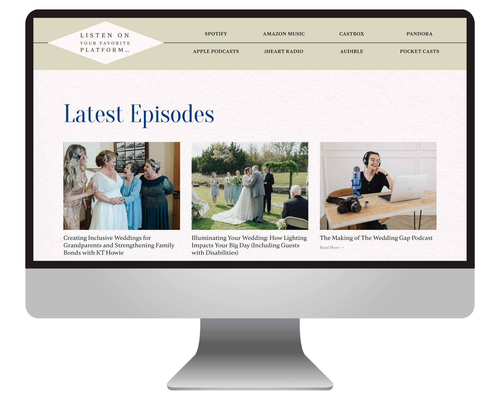
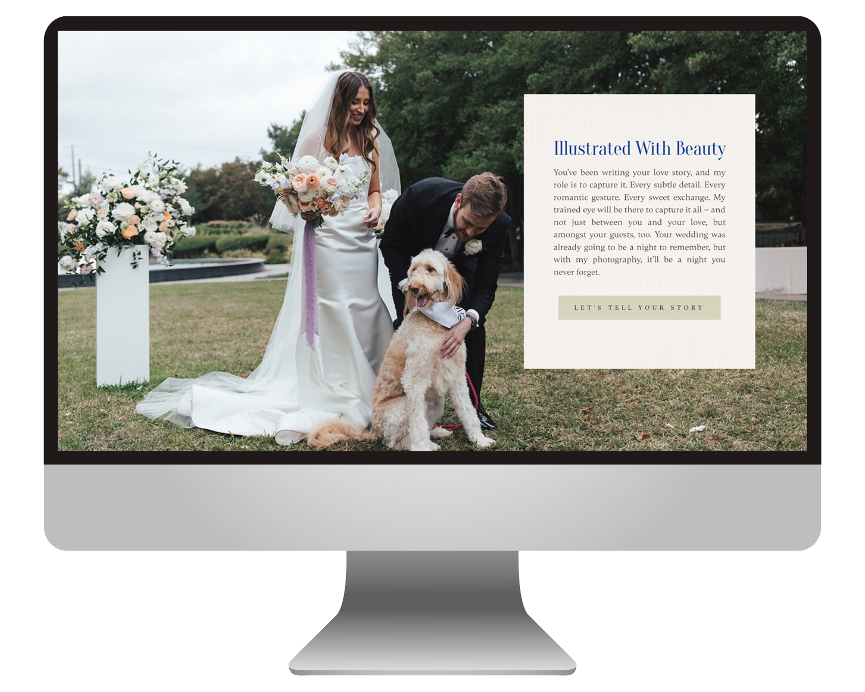
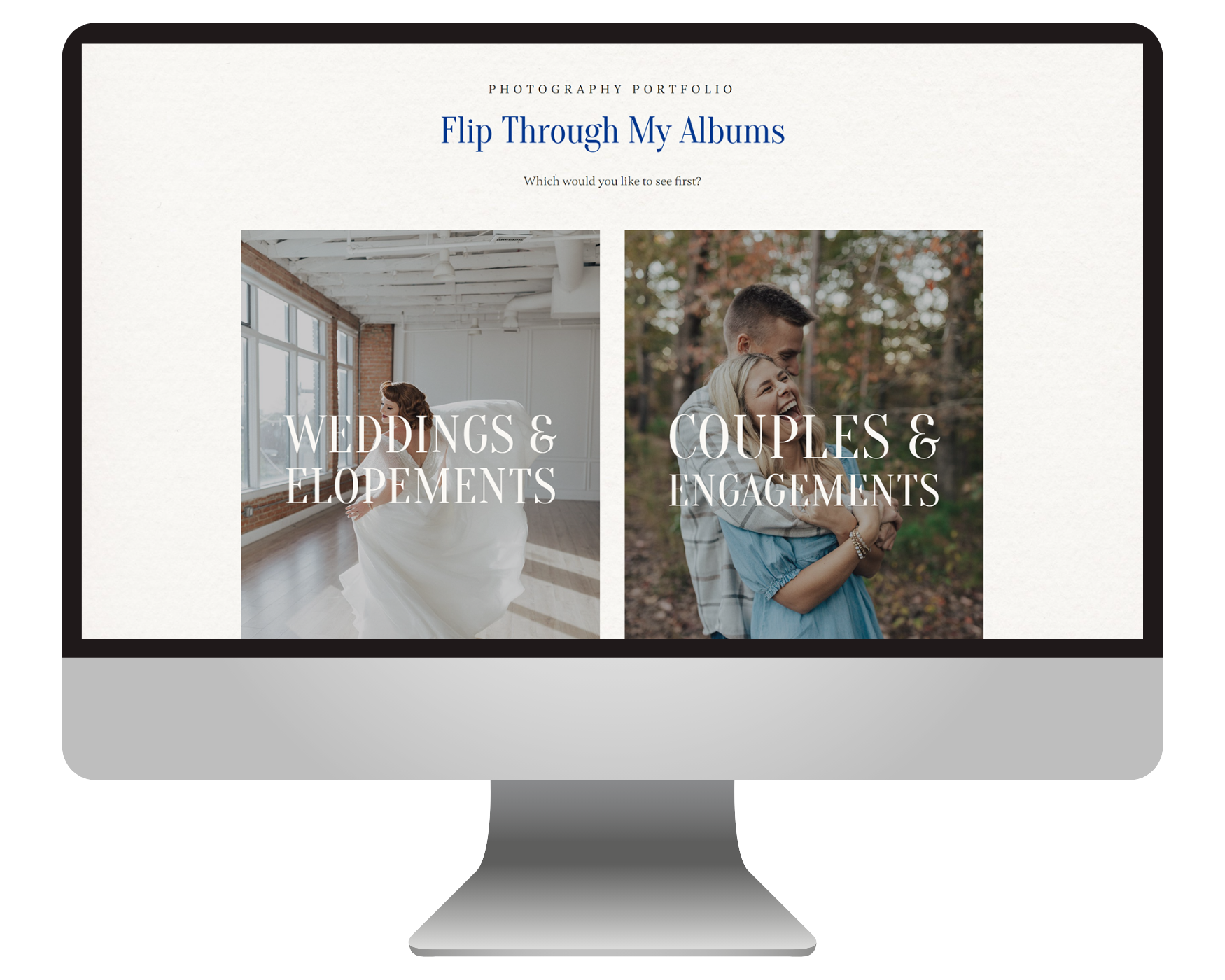
We also spent time curating the photos throughout the site. Annie's work is full of real emotion, meaningful relationships, and beautifully imperfect moments, so we wanted the image selections to reflect that. Plus, being intentional about the colors within the photos themselves helps the whole website feel more polished and luxurious. We love a little visual harmony around here ;)
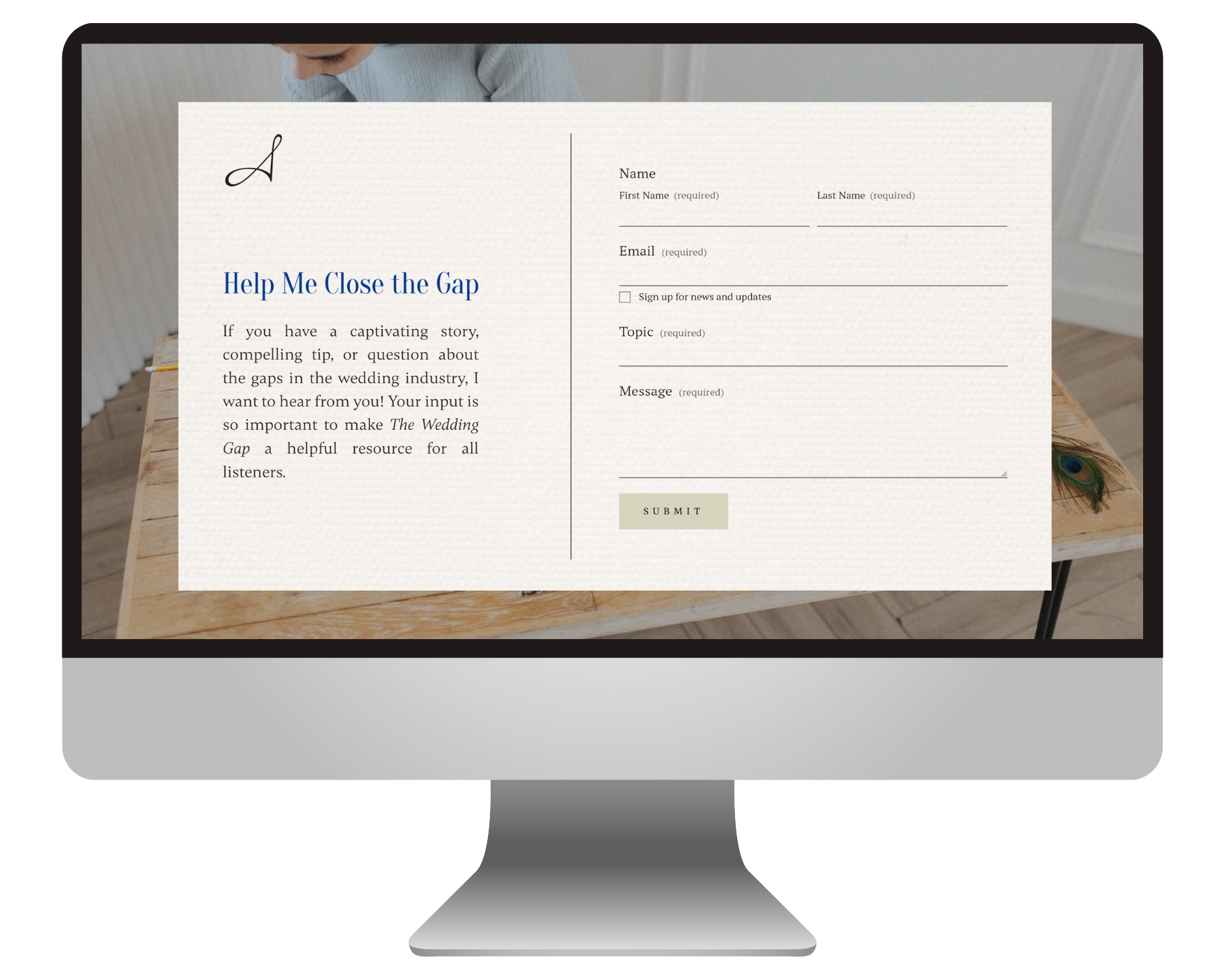
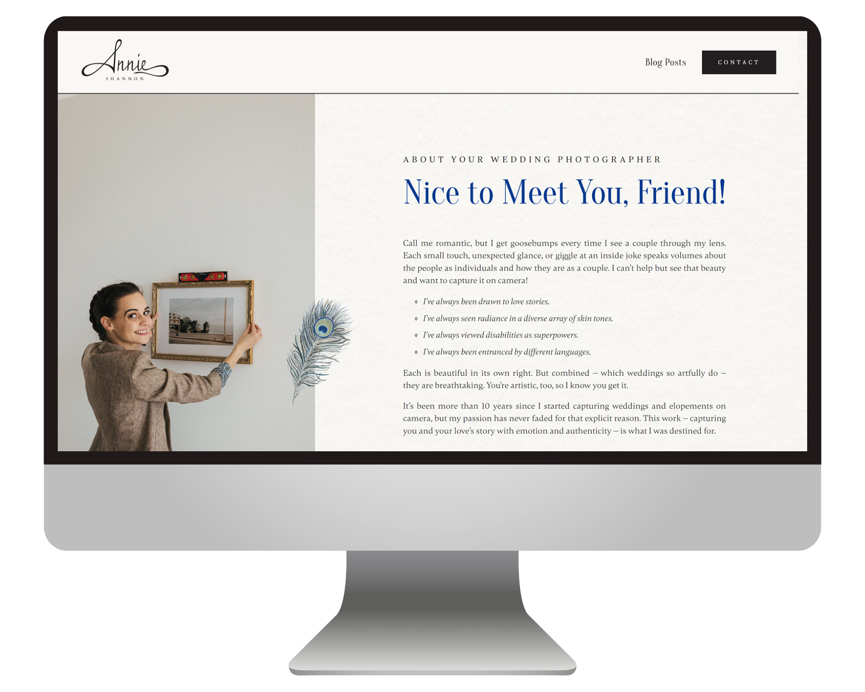
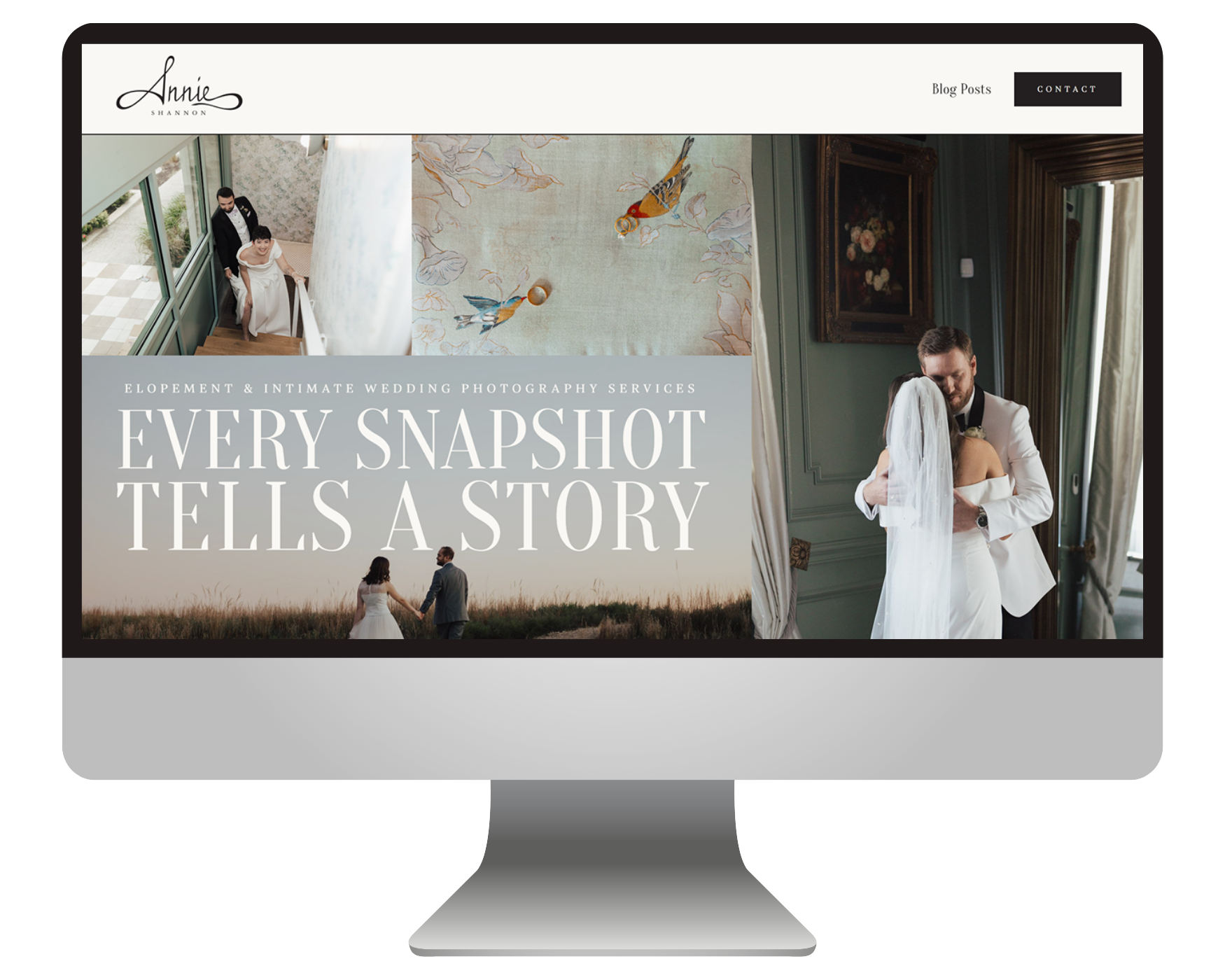
Typography played a big role, too. We paired a loosely mid-century-inspired display font with a handwritten accent font that feels a lot like Annie's actual handwriting. Then we rounded everything out with a paragraph font that looks like it could've come straight out of an old fashion magazine.
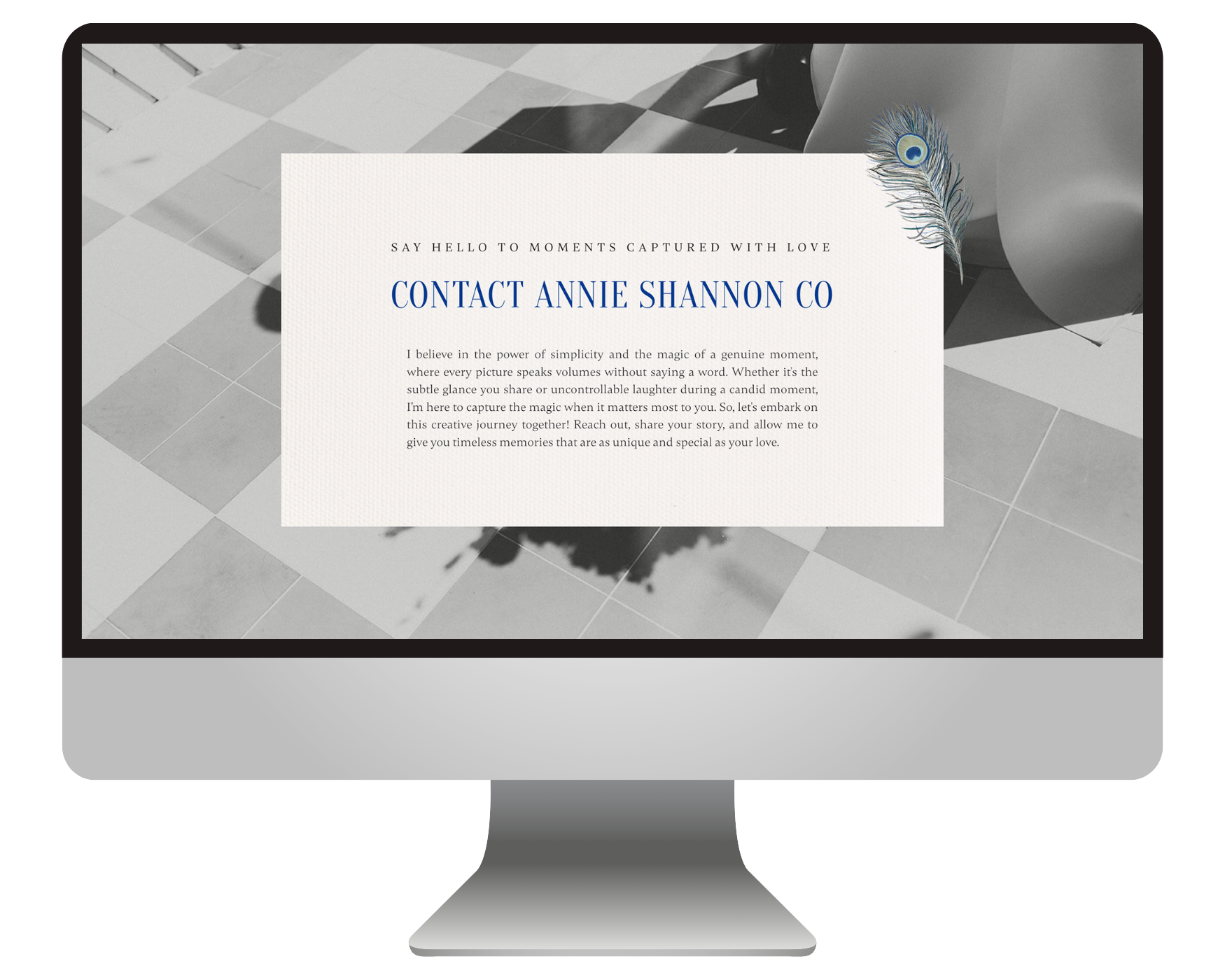
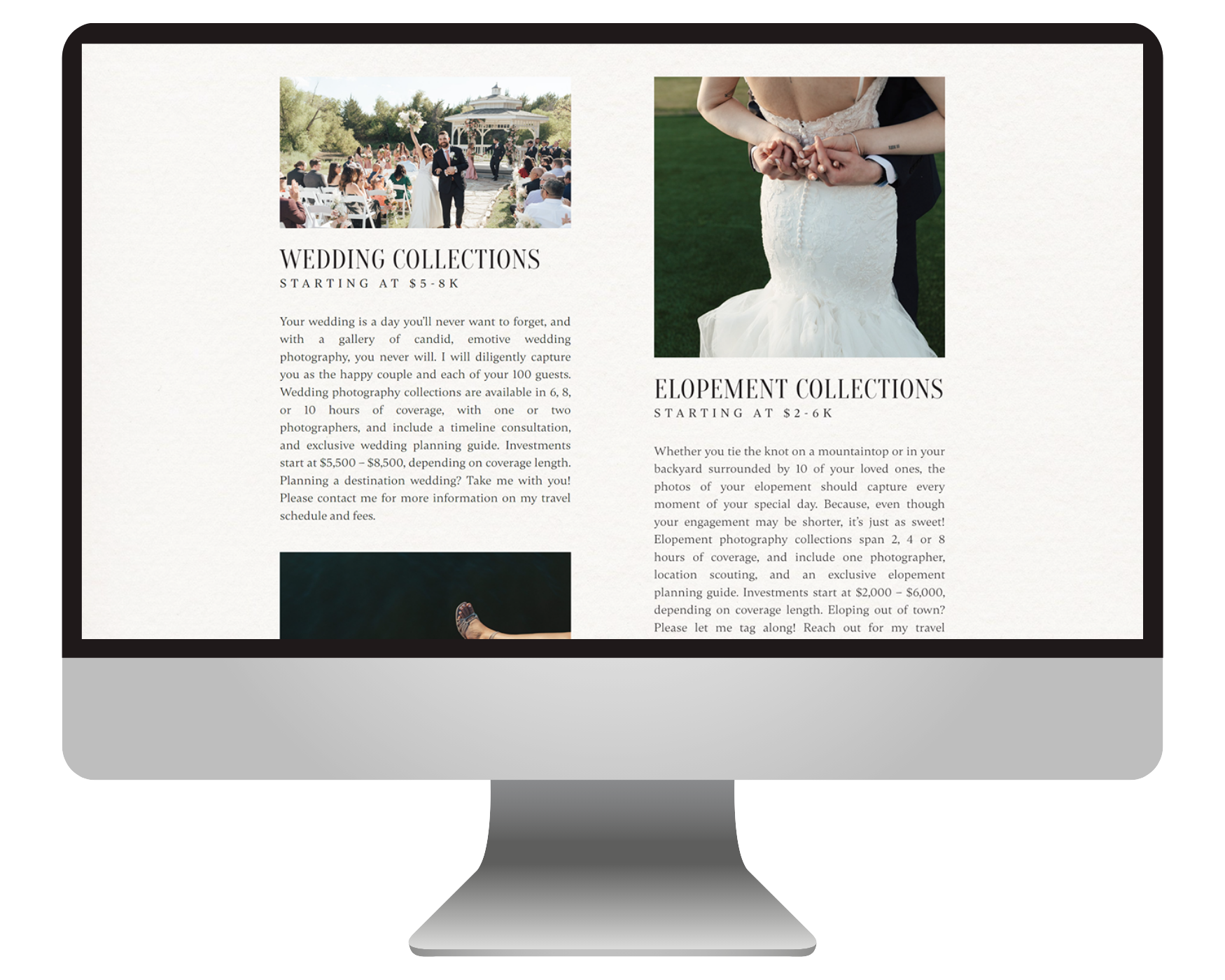
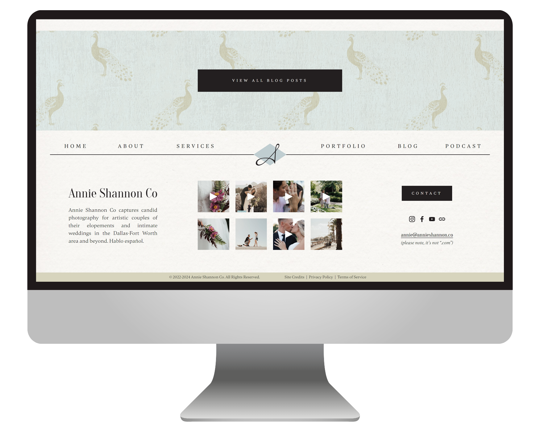
To reinforce the nostalgic direction, we incorporated subtle paper textures, a custom peacock wallpaper pattern inspired by Naomi's illustrations, postcard-inspired layouts, book-inspired typography treatments, and a simple diamond motif that nods back to Annie's logo.
The final result feels nostalgic without being kitschy, detailed without feeling busy, and most importantly, like Annie. Which is exactly what we were going for.
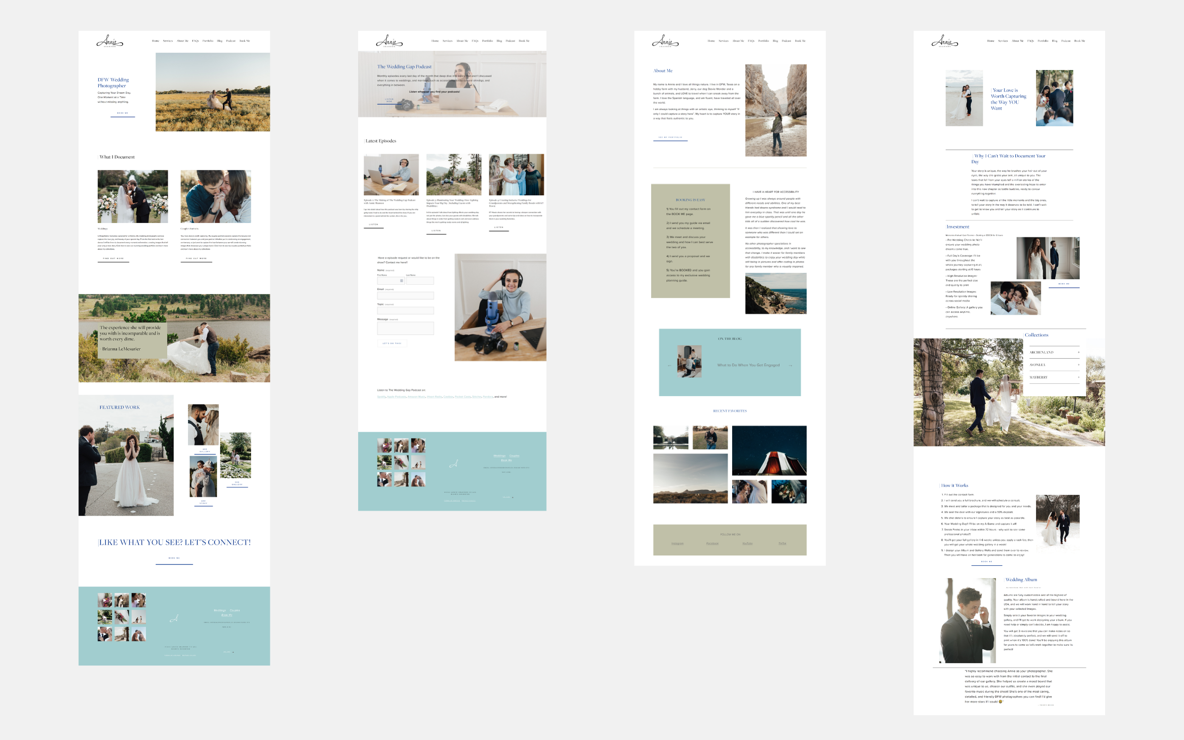
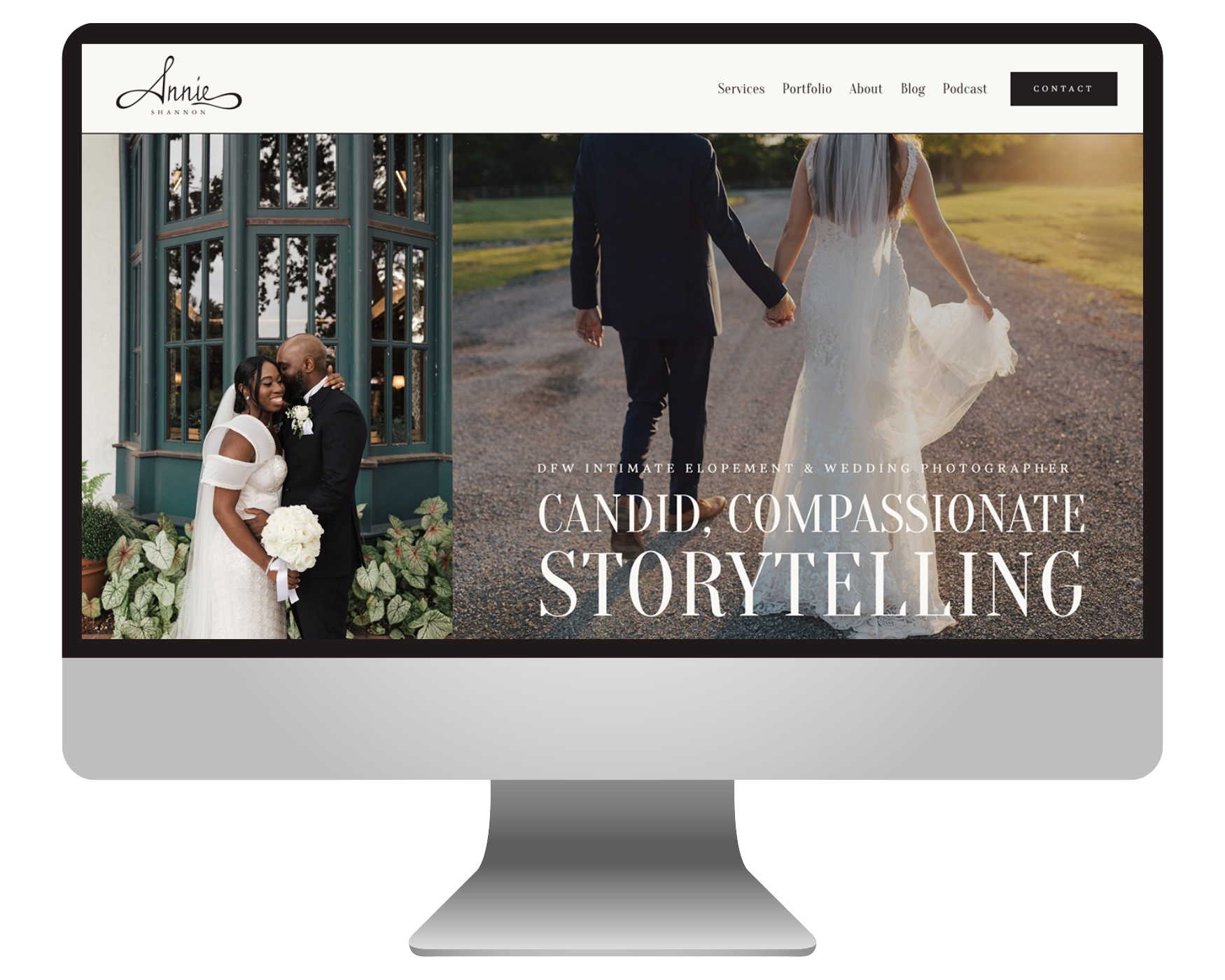
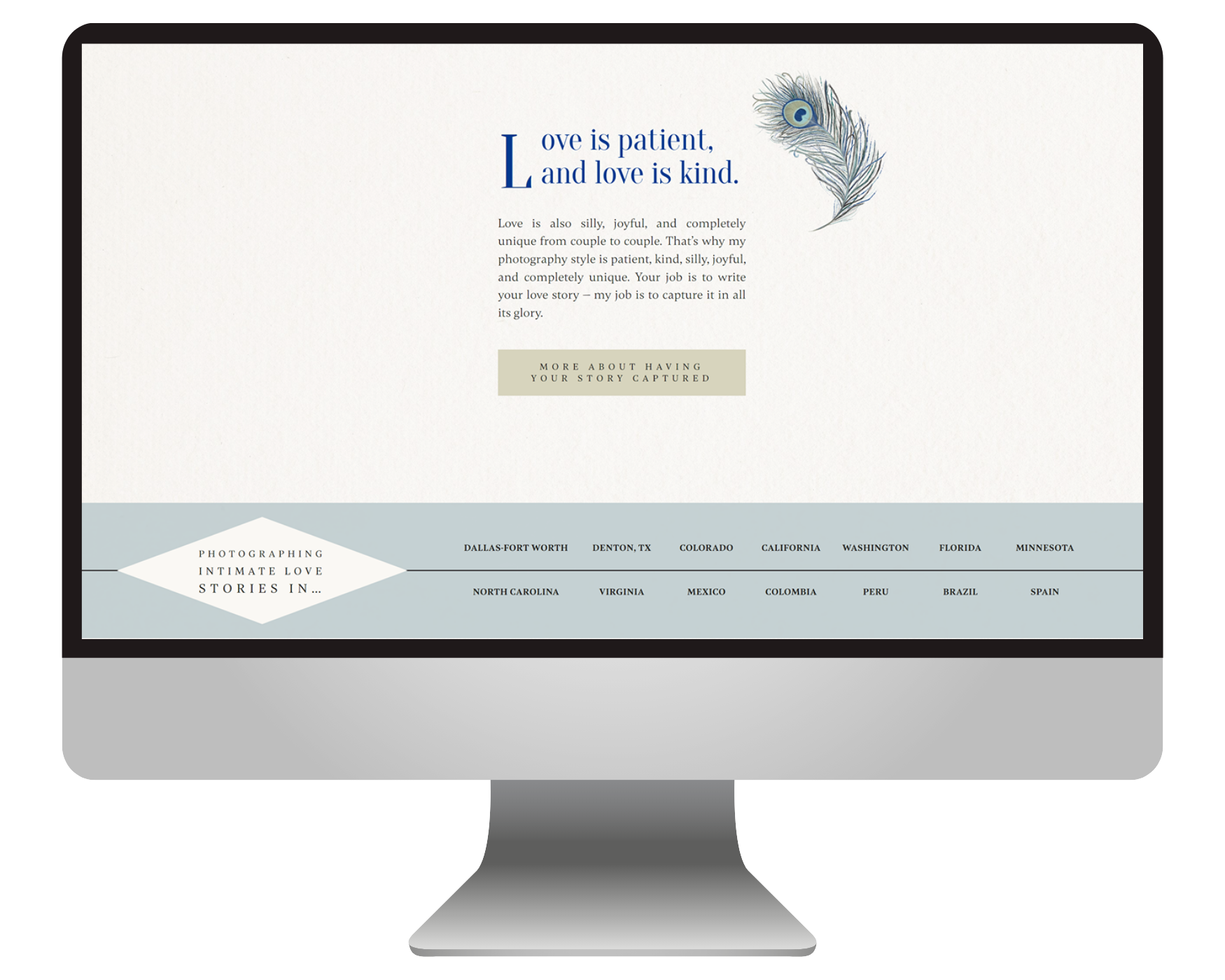
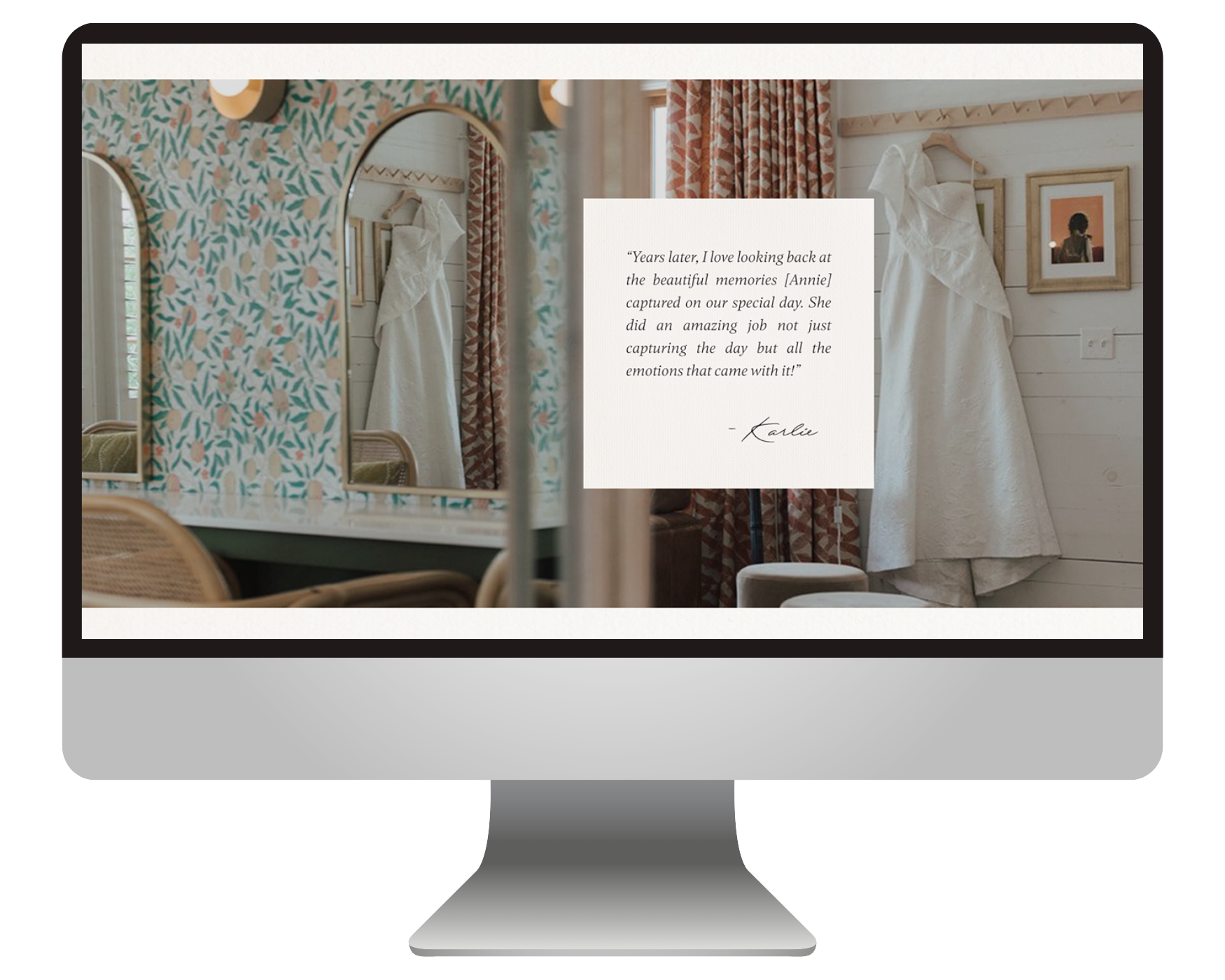
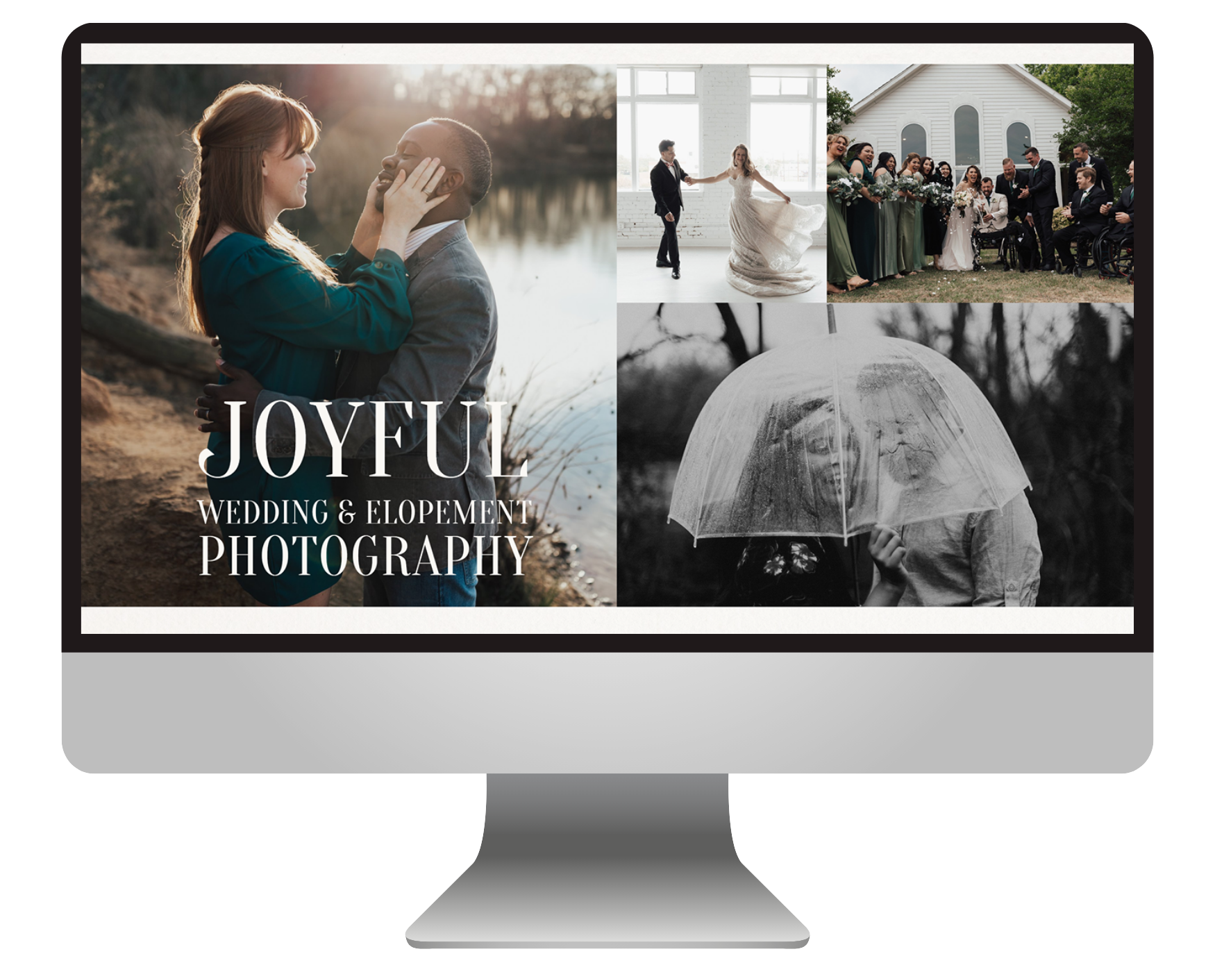
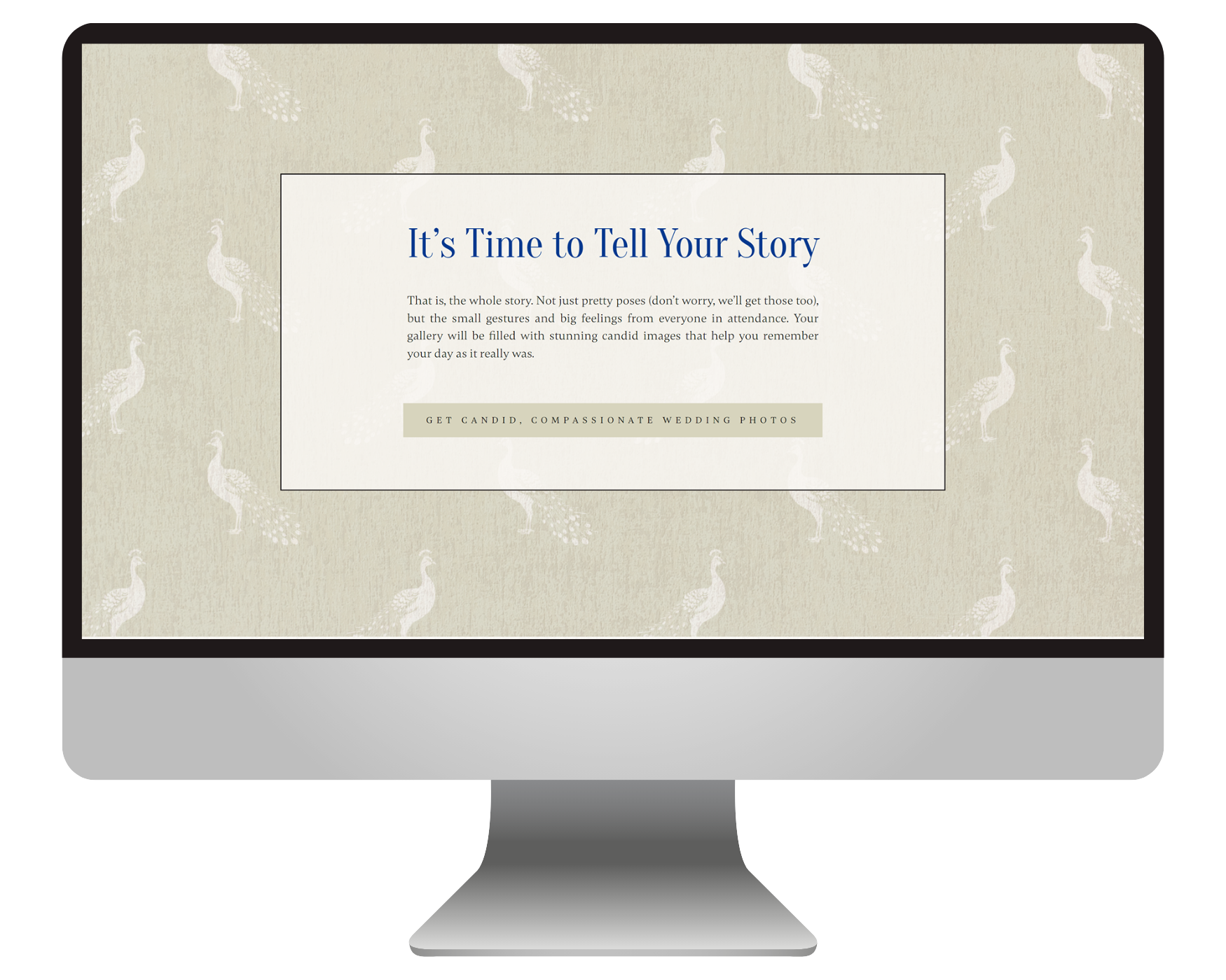
The revamped site:
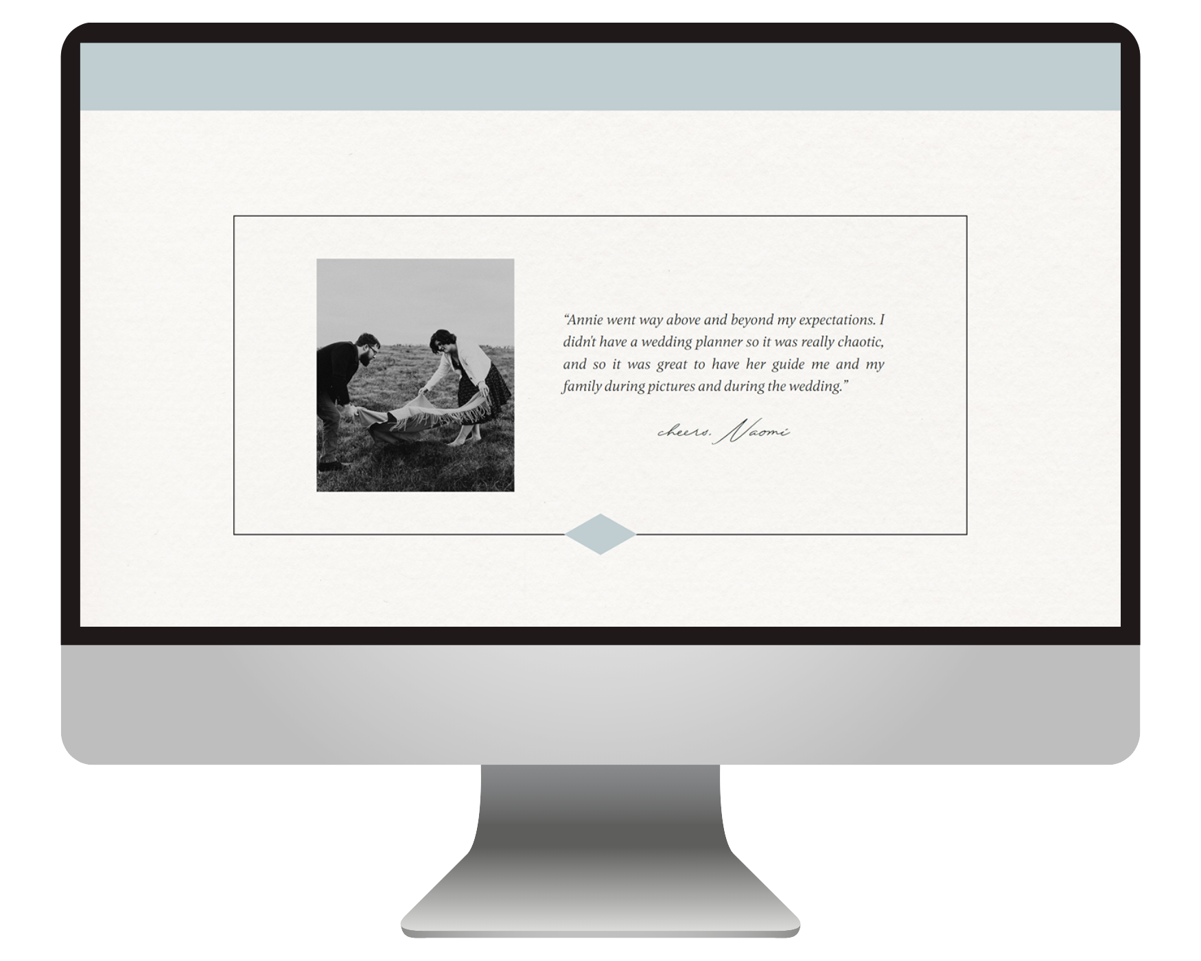
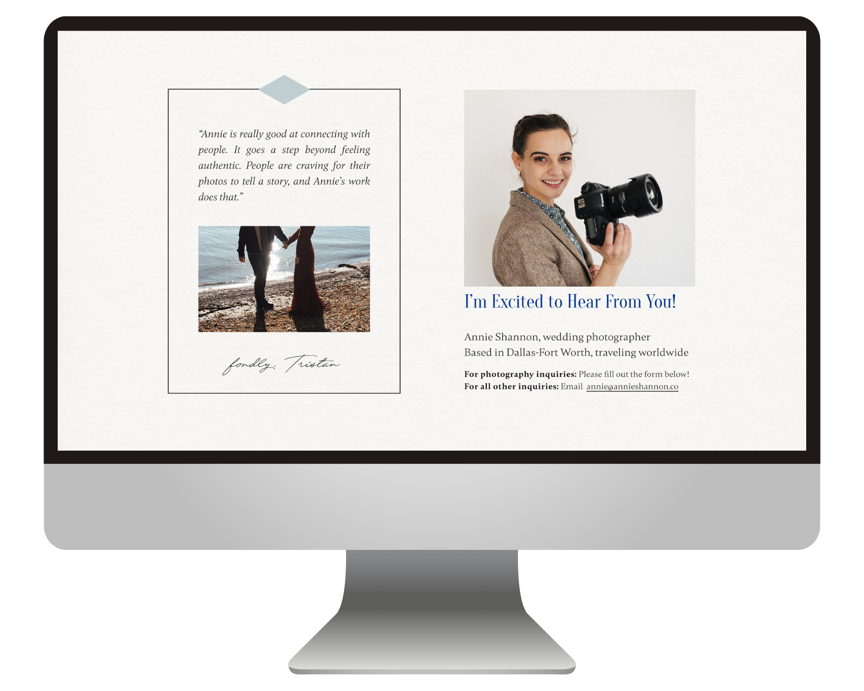

“I am a bajillion percent more confident sharing my website and brand with luxury wedding couples now.”
Emily went above and beyond and far surpassed my expectations. Not only is she super good at design and communication, but she also has a knack for taking your vision and making it come to life. In addition to giving me the most luxurious-looking website I have ever seen, she helped me narrow down my portfolio, she created new brand guidelines, helped me find elements and textures that elevated my brand. Her work is an investment that will return thousand-fold.
— Annie Shannon
Check out more BEJ web designs here: